LVGL for LuatOS Manual#
[toc]
Introduction#
Why is it LVGL#
LVGL is an open source graphics library that provides everything you need to create an embedded GUI with easy-to-use graphical elements, beautiful visuals and a low memory footprint.
LVGL Features:
Powerful building blocks: buttons, charts, lists, sliders, images, etc.
Advanced graphics engines: animation, anti-aliasing, opacity, smooth scrolling, blend modes, and more
Support various input devices: touch screen, mouse, keyboard, encoder, button, etc.
Support multiple displays
Hardware independent, can be used with any microcontroller and display
Scalable to operate with small memory (64 kB flash,16 kB RAM)
Multi-language support with UTF-8 processing, CJK, bidirectional and Arabic script support
Fully customizable graphic elements via CSS-styled
Operating system, external memory, and GPU supported, but not required
Smooth rendering even with single framebuffer
Written in C, compatible with C
Development on PC without embedded hardware simulator
100+ Simple Example
Online and PDF of the file and API reference
LVGL Official support for C language and MicroPython language development, LuatOS-Soc use the 7.11 version of the LVGL source code based on the production of the lua version of LVGL, so that you use the LuatOS-Soc to bring you a rapid development experience of colleagues, but also quickly and efficiently develop a beautiful graphical interface.
Equipment Requirements#
Basically, most controllers (which need to be able to drive the display) are suitable for running LVGL. The minimum requirement is:
Minimum |
recommend |
|
|---|---|---|
Architecture: |
16, 32, or 64-bit microcontroller or processor |
|
Clock Frequency: |
> 16 MHz |
> 48 MHz |
Flash/ROM: |
> 64 kB |
> 180 kB |
RAM: |
> 16 kB |
> 48 kB |
Display buffer: |
> 1 x horizontal resolution pixel |
> 1/10 screen resolution pixel |
Compiler: |
C99 or newer |
Note: Memory usage may vary by architecture, compiler, and build options。
Ask for help#
If you encounter problems in using LVGL, you can ask questions on Issues,Community and LVGL Official Forum. You can also give bug feedback or make suggestions to us, and we will reply in time.
LVGL Foundation#
Write a HelloWorld#
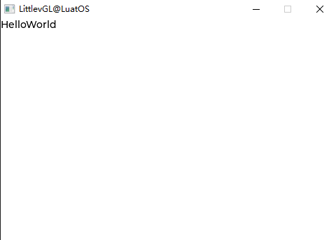
The first lesson for programmers to learn the language is HelloWorld. Here, the sample program showing the HelloWorld is also used to make you feel its convenience intuitively.:
lvgl.init(480,320)--lvgl Initialization
local label = lvgl.label_create(nil, nil)--Create Label label
lvgl.label_set_text(label, "HelloWorld")--Set label content
lvgl.scr_load(label)--Load Label
Operation effect:
Isn’t it simple? And it’s very similar to c, right? Let’s talk about the difference between the LuatOS version of the LVGL interface and the C version.
LuatOS Version of the LVGL interface#
lua The version of lvgl has already made most of the interfaces and will continuously improve the subsequent interfaces. Generally speaking, as long as the lv_at the beginning of the original interface is replaced with lvgl. That is, but there are also special cases, such as not supporting init to create components, using create to create, and font settings and lvgl symbols also have some differences.
Common Concepts#
Layout#
lvgl The layout should have the concept of layer, which introduces the concept of parent object, child object and front and back stage.
Event Model#
LVGL can use events to interact.
Style#
*Styles * are used to set the appearance of an object.
LVGL Components#
Quick View#
base object (obj) arc (arc) progress bar (bar) button (btn) button matrix (btnmatrix) calendar (calendar) canvas (canvas) check box (cb) chart (chart) container (cont) color selector (cpicker) drop-down list (dropdown) gauge (gauge) picture (img) picture button (imgbtn) keyboard (keyboard) label (label) LED(led) line (line)) list (list) meter (lmeter) message box (msdbox) object mask (objmask) page (page) roller (slider) number adjustment box (spinbox) spinner (spinner) switch (switch) table (table) tab (tabview) text box (textarea) tile view (tileview) window (win)
Base Object(obj)#
lvgl First of all, there must be the concept of object (obj), also called component (WIDGETS), that is, button, label, image, list, chart or text area, etc. They have unified basic properties:
Position (Location)
Size (Dimensions)
Parent (Parents)
Drag enable (Drag Enable)
Click enable (Click Enable)
position (Location)
…
We can set the set_xxx attribute of the object through lvgl.obj_xxx and obtain the get_xxx attribute through lvgl.obj_xxx
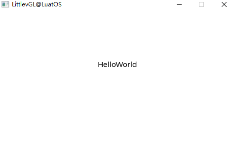
Lets understand the code intuitively. Taking the HelloWorld just now as an example, we add lvgl.obj_set_posto set the position,lvgl.obj_set_sizeto set the size,lvgl.obj_set_sizeto set the size,lvgl.obj_set_click` to set whether it can be clicked:
local label = lvgl.label_create(nil, nil)
lvgl.label_set_text(label, "HelloWorld")
lvgl.obj_set_pos(label, 200, 100);
lvgl.obj_set_size(label, 480, 172);
lvgl.obj_set_click(label, false);
lvgl.scr_load(label)
Operation effect:
In object-oriented thinking, inheritance can be done, which can reduce code duplication.
Arc(arc)#
Overview#
The arc consists of a background arc and a foreground arc. Both can have a starting and ending angle and a thickness.
Parts and Styles#
The main part of the arc is called lvgl. ARC_PART_MAIN . It draws the background using the typical background style attributes and draws the arc using the linetype attributes. The size and position of the arc will respect the properties of the fill pattern.
lvgl.ARC_PART_INDIC is a virtual part that draws another arc using the linetype attributes. Its fill value is interpreted relative to the background arc. The radius of the indicator arc is modified according to the maximum fill value.
lvgl.ARC_PART_KNOB is a virtual part, which is drawn at the end of the arc indicator. It uses all background properties and fill values. When using zero padding, the size of the knob is the same as the width of the indicator. A larger fill makes it larger, and a smaller fill makes it smaller.
Usage#
Angle#
To set the background angle, use the lvgl.arc_set_bg_angles(arc, start_angle, end_angle)function or lvgl.arc_set_bg_start/end_angle(arc, start_angle). Zero degrees is located in the right middle of the object (3 o`clock), and the degrees increase in a clockwise direction. The angle shall be within [0; 360].
Similarly, the lvgl.arc_set_angles(arc, start_angle, end_angle)function or the lvgl.arc_set_start/end_angle(arc, start_angle) function sets the angle of the indicator arc.
Swing#
You can use lvgl.arc_set_rotation(arc, deg)to add an offset to the 0 degree position.
Range and Value#
In addition to manually setting the angle, the arc can also have a range and a value. To set the range, use lvgl.arc_set_range(arc, min, max), and to set a value, use lvgl.arc_set_value(arc, value). Using the range and value, the angle of the indicator will be mapped between the background angles.
**Note **, setting angle and value are independent. Value and angle settings should be used. Mixing the two can lead to unexpected effects.
Type#
Arcs can have different “types”. They are set with `lvgl.arc_set_type. The following types exist:
lvgl.ARC_TYPE_NORMALIndicator arc drawn clockwise (minimum current)lvgl.ARC_TYPE_REVERSEThe indicator arc is drawn in a counterclockwise direction (maximum current)lvgl.ARC_TYPE_SYMMETRICThe indicator arc drawn from the middle point to the current value.
Event#
In addition to common events, the arc also sends the following special events:
lvgl.EVENT_VALUE_CHANGEDSent when an arc is pressed/dragged to set a new value.
Learn more about Events ().
Key#
The object type does not handle any input keystrokes.
Learn more about Keys 。
Example#
simple arc#
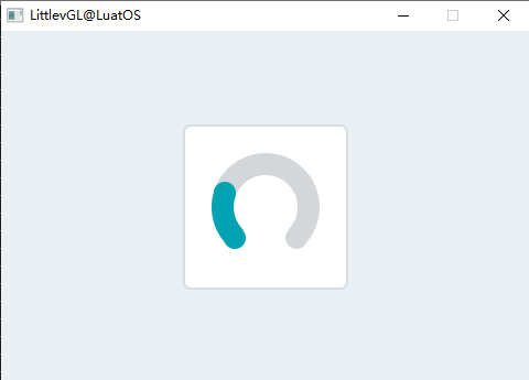
Sample code for the above effect:
    local arc = lvgl.arc_create(lvgl.scr_act(), nil)
    lvgl.arc_set_end_angle(arc, 200)
    lvgl.obj_set_size(arc, 150, 150)
    lvgl.obj_align(arc, nil, lvgl.ALIGN_CENTER, 0, 0)
Progress bar(bar)#
Overview#
The bar object has a background and an indicator on it. The width of the indicator is set according to the current value of the bar.
If the width of the object is less than its height, you can create a vertical bar.
Not only the end, but also the starting value of the bar can be set, thereby changing the starting position of the indicator.
Parts and Styles#
The main part of the progress bar is called lvgl. BAR_PART_BG , which uses typical background style properties.
lvgl.BAR_PART_INDIC is a dummy widget and also uses all the typical background properties. By default, the maximum size of the indicator is the same as the size of the background, but a positive fill value is set in lvgl. BAR_PART_BG will make the indicator smaller. (A negative value will make it larger) If the value style attribute is used on the indicator, the alignment will be calculated based on the current size of the indicator. For example, a center-aligned value is always displayed in the middle of the indicator, regardless of its current size.
Usage#
Value and Range#
The new value can be set via lvgl.bar_set_value(bar, new_value, lvgl.ANIM_ON/OFF). The value is interpreted in a range (minimum and maximum), which can be modified using lvgl.bar_set_range(bar, min, max). The default scope is 1..100。
lvgl.bar_set_value The new value in can be set with or without animation according to the last parameter (lvgl.ANIM_ON/OFF). The animation time can be adjusted by lvgl.bar_set_anim_time(bar, 100). The time is in milliseconds.
You can also use lvgl.bar_set_start_value(bar, new_value, lvgl.ANIM_ON/OFF)to set the starting value of the progress bar
Mode#
If it has been enabled bylvgl. bar_set_type(bar, lvgl.BAR_TYPE_SYMMETRICAL), the bar can be drawn symmetrically to zero (starting from zero, drawing from left to right)。
Event#
Only Common Events () are sent by object type.
Learn more about the Event.
Key#
The object type does not handle any input keystrokes.
Learn more about Keys 。
Example#
Simple progress bar#
Simple progress bar demo
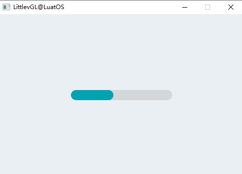
Sample code for the above effect:
    local bar1 = lvgl.bar_create(lvgl.scr_act(), nil);
    lvgl.obj_set_size(bar1, 200, 20);
    lvgl.obj_align(bar1, nil, lvgl.ALIGN_CENTER, 0, 0);
    lvgl.bar_set_anim_time(bar1, 2000);
    lvgl.bar_set_value(bar1, 100, lvgl.ANIM_ON);
Button(btn)#
Overview#
Buttons are simple rectangular objects. They are derived from the container, so they can also provide layout and fit. In addition, it can be enabled to automatically enter the inspection state when clicked.
Parts and Styles#
These buttons have only one major style, called lvgl. BTN_PART_MAIN , and all properties in the following groups can be used:
Background(background)
Boundary(border)
Border(outline)
Shadow(shadow)
Numerical(value)
Mode(pattern)
Transition(transitions)
It will also use the padding property when layout or fit is enabled.
Usage#
To simplify the use of the button, the state of the button can be obtained using `lvgl.btn_get_state(btn). It returns one of the following values:
lvgl.BTN_STATE_RELEASED Loosen
lvgl.BTN_STATE_PRESSED be clicked
lvgl.BTN_STATE_CHECKED_RELEASED Click and release
lvgl.BTN_STATE_CHECKED_PRESSED Repeat Click
lvgl.BTN_STATE_DISABLED Disable
lvgl.BTN_STATE_CHECKED_DISABLED
Use the lvgl.btn_set_state(btn, lvgl.BTN_STATE_...)to change the button state manually.
If you need a more precise description of the state (for example, focused), you can use the regular lvgl.obj_get_state(btn) 。
Can be checked#
The button can be configured as a toggle button using lvgl.btn_set_checkable(btn, true). In this case, when clicked, the button will automatically go to lvgl. STATE_CHECKED the `state, or return to the lvgl.STATE_CHECKED state when clicked again.
Layout and Fit#
Like containers, buttons have layout and fit properties.
lvgl.btn_set_layout(btn, lvgl.LAYOUT_...)Set the layout. The default value islvgl. LAYOUT_CENTER. Therefore, if you add a label, the label will be automatically aligned with the middle and cannot be moved bylvgl. obj_set_pos(). You can disable the layout using thelvgl.btn_set_layout(btn, lvgl.LAYOUT_OFF).lvgl.btn_set_fit/fit2/fit4(btn, lvgl.FIT_..)Allows to automatically set the width and/or height of the button according to the child, parent and suitable type.
Event#
In addition to Common Events, the button also sends the following special events:
lvgl.EVENT_VALUE_CHANGED-Sent when the button is toggled.
Learn more about Events (http://lvgl.100ask.net/7.11/documentation/03_overview/03_events.html).
Key#
The following keys are handled by the button:
lvgl.KEY_RIGHT/UP-If switching is enabled, the switching state is entered.
lvgl.KEY_LEFT/DOWN-If switching is enabled, the non-switching state is entered.
Attention, lvgl. The state of KEY_ENTER has transitioned to lvgl. EVENT_PRESSED/PRESSING/RELEASED etc.
Learn more about Keys 。
Example#
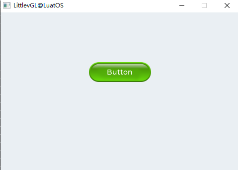
Simple button#
Create two simple buttons
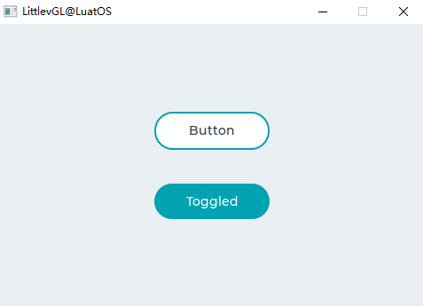
Sample code for the above effect:
    local function event_handler(obj, event)
            if(event == lvgl.EVENT_CLICKED) then
                    print("Clicked\n");
            elseif(event == lvgl.EVENT_VALUE_CHANGED) then
                    print("Toggled\n");
            end
    end

    local label
    local btn1 = lvgl.btn_create(lvgl.scr_act(), nil)
    lvgl.obj_set_event_cb(btn1, event_handler)
    lvgl.obj_align(btn1, nil, lvgl.ALIGN_CENTER, 0, -40)

    label = lvgl.label_create(btn1, nil)
    lvgl.label_set_text(label, "Button")

    local btn2 = lvgl.btn_create(lvgl.scr_act(), nil)
    lvgl.obj_set_event_cb(btn2, event_handler)
    lvgl.obj_align(btn2, nil, lvgl.ALIGN_CENTER, 0, 40)
    lvgl.btn_set_checkable(btn2, true)
    lvgl.btn_toggle(btn2)
    lvgl.btn_set_fit2(btn2, lvgl.FIT_NONE, lvgl.FIT_TIGHT)

    label = lvgl.label_create(btn2, nil)
    lvgl.label_set_text(label, "Toggled")
Button Matrix(btnmatrix)#
Overview#
Button matrix object can display multiple buttons in rows and columns。
The main reason for wanting to use a button matrix instead of a container and a single button object is:
The button matrix is easier to use for grid-based button layouts.
The button matrix consumes much less memory per button.
Parts and Styles#
The main part of the button matrix is called lvgl. BTNMATRIX_PART_BG . It draws the background using typical background style properties.
lvgl.BTNMATRIX_PART_BTNis the virtual part, which refers to the keys on the key matrix. It also uses all the typical background properties.
The top/bottom/left/right fill values from the background are used to reserve some space on both sides. Inner padding is applied between the buttons.
Usage#
One check#
The “check once” function can be enabled through thelvgl. btnmatrix_ set_one_check(btnm, true)to check (switch) one button only at a time.
Recolor#
You can recolor the text on a label, similar to the recoloring of Label objects. To enable it, use lvgl.btnmatrix_ set_recolor(btnm, true). After that, the button with #FF0000 red# text will turn red.
Precautions#
Button The weight of the matrix object is very light, because the button is not drawn in the virtual flight. This way, a button only uses 8 extra bytes, instead of the ~ 100-150 byte size of the ordinary Button object (plus the size of its container and the label of each button)。
The disadvantage of this setting is that the function of setting the style of each button to be different from other buttons is limited (except for the switching function). If you need this feature, using a single button is likely to be a better way.
Event#
In addition to Common Events, the button matrix also sends the following special events:
lvgl.EVENT_VALUE_CHANGED - Sent when the button is pressed/released or repeated after a long press. The event data is set to the button press/release ID。
Learn more about Events (http://lvgl.100ask.net/7.11/documentation/03_overview/03_events.html).
Example#
Simple Button Matrix#
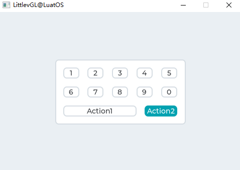
Sample code for the above effect:
local function event_handler(obj, event)
    if(event == lvgl.EVENT_VALUE_CHANGED) then
            local txt = lvgl.btnmatrix_get_active_btn_text(obj)
            print(string.format("%s was pressed\n", txt))
    end
end

function btnmatrix_demo.demo()
    local btnm_map = {"1", "2", "3", "4", "5", "\n",
                    "6", "7", "8", "9", "0", "\n",
                    "Action1", "Action2",""}

    local btnm1 = lvgl.btnmatrix_create(lvgl.scr_act(), nil)
    lvgl.btnmatrix_set_map(btnm1, btnm_map)
    lvgl.btnmatrix_set_btn_width(btnm1, 10, 2)        --Make "Action1" twice as wide as "Action2"
    lvgl.btnmatrix_set_btn_ctrl(btnm1, 10, lvgl.BTNMATRIX_CTRL_CHECKABLE)
    lvgl.btnmatrix_set_btn_ctrl(btnm1, 11, lvgl.BTNMATRIX_CTRL_CHECK_STATE)
    lvgl.obj_align(btnm1, nil, lvgl.ALIGN_CENTER, 0, 0)
    lvgl.obj_set_event_cb(btnm1, event_handler)
end
Calendar(calendar)#
Overview#
Calendar object is a classic calendar that can:
Highlight the day
Highlight any user-defined date
Show Date Name
Click the button to go to the next/previous month
Highlight days clicked
Parts and Styles#
The main part of the calendar is called lvgl. CALENDAR_PART_BG . It draws the background using typical background style properties.
In addition to the following virtual sections:
lvgl.CALENDAR_PART_HEADERThe upper region that displays the current year and month names. It also has buttons for moving next/last month. It uses typical background properties and padding to adjust its size and margins to set the distance from the top of the calendar and the date below the calendar.lvgl.CALENDAR_PART_DAY_NAMESDisplays the date name below the title. It uses text style attribute padding to keep a certain distance from the background (left and right), title (top) and date (bottom).lvgl.CALENDAR_PART_DATESDisplay date numbers starting from 1 .. 28 / 29/30/31 (depending on the current month). draw different “states of a state according to the states defined in this section”:Normal date: in
lvgl. STATE_DEFAULTStyle DrawBy date range:
lvgl. STATE_PRESSEDStyle DrawToday: With
lvgl. STATE_FOCUSEDStyle DrawHighlighted date:
lvgl. STATE_CHECKEDStyle Draw
Usage#
Overview#
To set and get dates in the calendar, use the lvgl.calendar_ date_t type, which is a structure with YE, Month and Day fields.
Current Date#
To set the current date (today), use the lvgl.calendar_ set_today_date(calendar, today_date)function.
Show date#
To set the display date, use lvgl.calendar_set_shown_date(calendar, &shown_date) ;
Highlight Date#
The highlighted date list should be stored in the lvgl.calendar_ date_t array loaded by the `lvgl.calendar_ set_highlighted_dates(calendar, highlighted_dates).
Only array pointers will be saved, so arrays should be static or global variables.
Date Name#
You can use lvgl.calendar_ set_day_names(calendar, day_names)to adjust the name of the date, where day_names is similar local day_names = {“Su”, “Mo”, …};`
Month Name#
Similar to day_names, you can use lvgl.calendar_ set_month_names(calendar, month_names_array) to set the month name.
Event#
In addition to General Events, the calendar will also send the following special events: When the current month changes, it will also send lvgl.EVENT_VALUE_CHANGED 。
In the event related to the input device, lvgl.calendar_ get_pressed_date(calendar)indicates the date currently being pressed, if no date is pressed, it returns nil 。
Button#
The object type does not handle any buttons.
Example#
Simple Calendar Example#
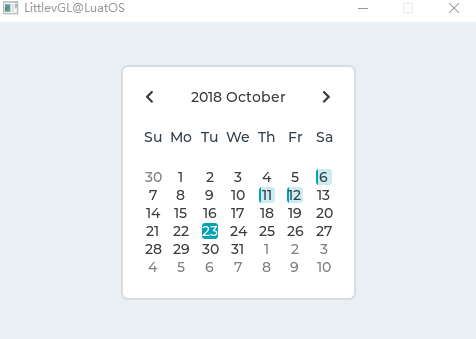
Sample code for the above effect:
local function event_handler(obj, event)
    if(event == lvgl.EVENT_VALUE_CHANGED) then
            local date = lvgl.calendar_get_pressed_date(obj);
    end
end

	local calendar = lvgl.calendar_create(lvgl.scr_act(), nil);
    lvgl.obj_set_size(calendar, 235, 235);
    lvgl.obj_align(calendar, nil, lvgl.ALIGN_CENTER, 0, 0);
    lvgl.obj_set_event_cb(calendar, event_handler);

    --Make the date number smaller to be sure they fit into their area
    lvgl.obj_set_style_local_text_font(calendar, lvgl.CALENDAR_PART_DATE, lvgl.STATE_DEFAULT, lvgl.theme_get_font_small());

    --Set today's date
    local today = lvgl.calendar_date_t()
    today.year = 2018;
    today.month = 10;
    today.day = 23;

    lvgl.calendar_set_today_date(calendar, today);
    lvgl.calendar_set_showed_date(calendar, today);

    local highlighted_days1 = lvgl.calendar_date_t()
    highlighted_days1.year = 2018;
    highlighted_days1.month = 10;
    highlighted_days1.day = 6;

    local highlighted_days2 = lvgl.calendar_date_t()
    highlighted_days2.year = 2018;
    highlighted_days2.month = 10;
    highlighted_days2.day = 11;

    local highlighted_days3 = lvgl.calendar_date_t()
    highlighted_days3.year = 2018;
    highlighted_days3.month = 10;
    highlighted_days3.day = 12;

    local highlighted_days = {highlighted_days1,highlighted_days2,highlighted_days3}
    lvgl.calendar_set_highlighted_dates(calendar, highlighted_days, 3);
Canvas(canvas)#
Overview#
Parts and Styles#
Usage#
Event#
Key handling#
Example#
Check Box(cb)#
Overview#
The checkbox (Checkbox) object is built from a Button background, and the Button background also contains Button bullets and Label to implement the classic checkbox.
Parts and Styles#
The main part of the checkbox is called lvgl. CHECKBOX_PART_BG . It is a container for the bullet and the text next to it. The background uses all the typical background style properties.
Bullets are real base object (lvgl.obj) and can be used as lvgl. CHECKBOX_PART_BULLET quote. Bullets automatically inherit the background state. Therefore, when the background is pressed, the bullet will also enter the pressed state. Bullets also use all the typical background style properties.
The label has no dedicated part. Because the text style property is always inherited, you can set its style in the background style.
Usage#
Text#
The text can be modified by the lvgl.checkbox_ set_text(cb, "New text")function. It will dynamically assign text.
To set static text, use lvgl.checkbox_ set_static_text(cb, txt). In this way, only the txt pointer will be stored, and the pointer should not be released when the check box is present.
Check/Uncheck#
Checkboxes can be manually checked/unchecked via lvgl.checkbox_ set_checked(cb, true/false). Set to trueto select the check box, and set tofalse` to deselect the check box.
Disable check box#
To disable the check box, call lvgl.checkbox_set_disabled(cb, true) .
Get/Set Checkbox State#
You can use the lvgl.checkbox_ get_state(cb)function to get the current state of the Checkbox, which returns the current state. You can use the lvgl.checkbox_ set_state(cb, state)to set the current state of the checkbox. The available states defined by the enumeration `lvgl.btn_state_t are:
lvgl.BTN_STATE_RELEASED
lvgl.BTN_STATE_PRESSED
lvgl.BTN_STATE_DISABLED
lvgl.BTN_STATE_CHECKED_RELEASED
lvgl.BTN_STATE_CHECKED_PRESSED
lvgl.BTN_STATE_CHECKED_DISABLED
Event#
In addition to Common Events, the checkbox supports the following Special Events :
lvgl.EVENT_VALUE_CHANGED - Sent when the check box is toggled.
Note that events related to generic input devices, such as lvgl.EVENT_PRESSED, are also sent in an inactive state. The status needs to be checked using lvgl.cb_is_inactive(cb) to ignore events in inactive checkboxes.
Learn more about events.
Key#
check box to handle the following keys:
lvgl.KEY_RIGHT/UP - Enter the toggle state if toggle is enabled
lvgl.KEY_LEFT/DOWN - If switching is enabled, enter non-switching state
Note that, as always, the lvgl.KEY_ENTER state transitions to lvgl.EVENT_PRESSED / PRESSING/RELEASED, etc.
Learn more about Key (http://lvgl.100ask.net/7.11/documentation/03_overview/05_indev.html).
Example#
Simple check box#
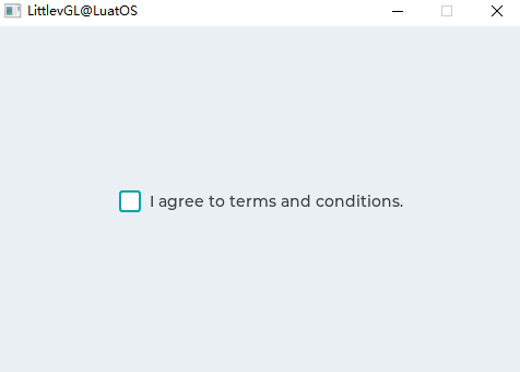
Sample code for the above effect:
local function event_handler(obj, event)
    if(event == lvgl.EVENT_CLICKED) then
        if lvgl.checkbox_is_checked(obj) == true then
            print("State: Checked\n")
        else
            print("State: Unchecked\n")
        end
    end
end

local cb = lvgl.checkbox_create(lvgl.scr_act(), nil)
    lvgl.checkbox_set_text(cb, "I agree to terms and conditions.")
    lvgl.obj_align(cb, nil, lvgl.ALIGN_CENTER, 0, 0)
    lvgl.obj_set_event_cb(cb, event_handler)
Chart(chart)#
Overview#
Charts are the basic objects for visualizing data points. They support line charts (connecting points with lines and/or drawing points on them) and column charts.
The chart also supports dividers, 2 y-axis, tick marks and tick text.
Parts and Styles#
The main part of the chart is called lvgl. CHART_PART_BG , which uses all the typical background properties. The text style property determines the style of the axis text, and the line property determines the style of the tick marks. The padding value adds some space on the side, thus making the sequence area smaller. Fill can also be used to make room for axis text and tick marks.
The background of the series is called lvgl. CHART_PART_SERIES_BG , which sits on the main background. Divider lines and series data are drawn on this section. In addition to the typical background style attributes, split lines use linetype attributes. The fill value indicates the spacing between this part and the axis text.
lvgl.CHART_PART_SERIES You can reference the styles of the series. For column types, use the following properties:
radius: radius of the data point
padding_inner:Spacing between columns of the same x coordinate
If it is a linetype graph, use the following properties:
Line attributes to describe a line
Size radius of point
bg_opa:Overall opacity of the area below the line
bg_main_stop:% bg_opa at the top to create an alpha fade (0: transparent at the top, 255:bg_opa at the top)
bg_grad_stop:The percentage of the bottom bg_opa to create an alpha gradient (0: transparent bottom, 255:bg_opa top)
bg_drag_dir:Should
lvgl. GRAD_DIR_VERAllows Alpha Fade Through bg_main_stop and bg_grad_stop
lvgl.CHART_PART_CURSOR Reference cursors. You can add any number of cursors, and you can set its appearance through the style properties associated with the row. Sets the color of the cursor when it is created and overrides the line_color style with that value.
Usage#
Data Series#
You can add any number of series to the chart via lvgl.chart_add_series(chart, color). It allocates data to the lvgl.chart_u series_t structure containing the selected color. If an external array is not used, if an external array is allocated, any internal points associated with the series will be released, and the sequence points to the external array.
Series Type#
The following data display types exist:
lvgl.CHART_TYPE_NONE - No data is displayed. It can be used to hide the series.
lvgl.CHART_TYPE_LINE - Draw a line between two points.
lvgl.CHART_TYPE_COLUMN - Draw the column.
You can specify the display type using the lvgl.chart_set_type(chart, lvgl.CHART_TYPE_...). You can OR types (e. g. lvgl.CHART_TYPE_LINE` )。
Modify data#
There are several options to set the series data:
Manually set the value in the array, for example
ser1->points[3] = 7, and then uselvgl.chart_refresh(chart)to refresh the chart.Use
lvgl.chart_set_point_id(chart, ser, value, id), where id is the index of the point you want to update.Use
lvgl.chart_set_next(chart, ser, value)。Use
lvgl.chart_init_points(chart, ser, value)to initialize all points to a given value.Use
lvgl.chart_set_points(chart, ser, value_array)to set all points in the array.
Use lvgl. CHART_POINT_DEF as a value causes the library to skip drawing the point, column, or line segment.
Override the default starting point for the series#
If you want the plot to start at a point other than the default point (point [0] of the sequence), you can use the lvgl.chart_set_x_start_point(chart, ser, id)function to set the alternate index, where id is the new index position to start from.
Set up an external data source#
You can use the following function to update a chart series from an external data source: lvgl.chart_set_ext_array(chart, ser, array, point_cnt ), where array is an external array of lvgl.coord_t and point_cnt elements. Note: After updating the external data source, you should call lvgl.chart_refresh(chart)to update the chart.
Get the current chart information#
There are four functions to get information about the chart:
lvgl.chart_get_type(chart)Returns the current chart type.lvgl.chart_get_point_count(chart)Returns the current chart points.lvgl.chart_get_x_start_point(ser)Returns the current drawing index for the specified series.lvgl.chart_get_point_id(chart, ser, id)Returns the data value at a specific index of the specified series.
Update mode#
lvgl.chart_set_next Can be run in two ways, depending on the update mode:
lvgl.CHART_UPDATE_MODE_SHIFT - Move the old data to the left and add the new data to the right.
lvgl.CHART_UPDATE_MODE_CIRCULAR - Cycle to add new data (such as ECG chart)。
You can use lvgl.chart_set_update_mode(chart, lvgl.CHART_UPDATE_MODE_...)to change the update mode.
Number of buoys#
The number of points in the series can be modified by `lvgl.chart_set_point_count(chart, point_num). The default value is 10. Note: When an external buffer is allocated to the sequence, this also affects the number of points processed.
Vertical range#
The minimum and maximum values may be specified in the y-direction using `lvgl.chart_set_range(chart, y_min, y_max). The value of the point is scaled proportionally. The default scope is:0..100。
Split line#
The number of horizontal and vertical dividing lines can be modified by `lvgl.chart_set_div_line_count(chart, hdiv_num, vdiv. The default setting is 3 horizontal split lines and 5 vertical split lines.
Ticks and Labels#
Scales and labels can be added to the axis.
lvgl.chart_set_x_tick_text(chart, list_of_values, num_tick_marks, lvgl.CHART_AXIS_...) Set the scale and text on the x-axis. list_of_values is a string with \n terminating text (expect the last one), which contains the text used for the scale. list_of_values is a string with \n terminating text (expect the last one), which contains the text used for the scale. For example. const char * list_of_values = "first\nsec\nthird" . The list_of_values can be NULL . If list_of_values is set, num_tick_marks tells the number of ticks between the two labels. If list_of_values is NULL, it specifies the total number of ticks.
The primary tick marks are drawn where the text is placed, and the secondary tick marks are drawn elsewhere. [](http://lvgl.100ask.net/7.11/documentation/04_widgets/09_chart.html#id15)lvgl.chart_set_x_tick_length(chart, major_tick_len, minor_tick_len) sets the length of the tick mark on the x-axis.
y The same function exists for the axis: lvgl.chart_set_y_tick_text and lvgl.chart_set_y_tick_length 。
Cursor#
You can use lvgl.chart_cursor_t * c1 = lvgl.chart_add_cursor(chart, color, dir);to add the cursor. dir lvgl. The possible values of CHART_CURSOR_NONE/RIGHT/UP/LEFT/DOWN or their OR-ed values are used to indicate in which direction the cursor should be drawn.
lvgl.chart_set_cursor_point(chart, cursor, &point) Sets the position of the cursor. point is a pointer to the lvgl. point_t variable. For example. lvgl.point_t point = {10,20};. The point is relative to the series area of the chart.
lvgl.coord_t p_index = lvgl.chart_get_nearest_index_from_coord(chart, x) Tells which point index is closest to the X coordinate (relative to the sequence area). For example, it can be used to snap the cursor to a point when you click on a chart.
lvgl.chart_get_x_from_index(chart, series, id) and lvgl.chart_get_y_from_index(chart, series, id)tell the X and Y coordinates of a given point. It is useful to place the cursor at a given point.
You can use lvgl.chart_get_series_area(chart, & area)to retrieve the current series area, where area is a pointer to the lvgl.area_t variable to store the result. The area has absolute coordinates.
Event#
Only generic events are sent per object type.
Learn more about Events (http://lvgl.100ask.net/7.11/documentation/03_overview/03_events.html).
Key#
The object type does not handle any keys.
Learn more about Keys 。
Example#
Line Chart#
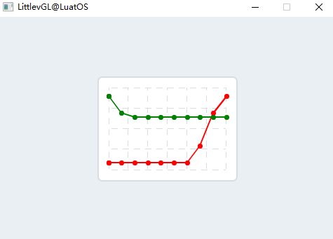
Sample code for the above effect:
    --Create a chart
    local chart;
    chart = lvgl.chart_create(lvgl.scr_act(), nil);
    lvgl.obj_set_size(chart, 200, 150);
    lvgl.obj_align(chart, nil, lvgl.ALIGN_CENTER, 0, 0);
    lvgl.chart_set_type(chart, lvgl.CHART_TYPE_LINE);   --Show lines and points too*/

    --Add two data series
    local ser1 = lvgl.chart_add_series(chart, lvgl.color_make(0xFF, 0x00, 0x00));
    local ser2 = lvgl.chart_add_series(chart, lvgl.color_make(0x00, 0x80, 0x00));

    --Set the next points on 'ser1'
    lvgl.chart_set_next(chart, ser1, 10);
    lvgl.chart_set_next(chart, ser1, 10);
    lvgl.chart_set_next(chart, ser1, 10);
    lvgl.chart_set_next(chart, ser1, 10);
    lvgl.chart_set_next(chart, ser1, 10);
    lvgl.chart_set_next(chart, ser1, 10);
    lvgl.chart_set_next(chart, ser1, 10);
    lvgl.chart_set_next(chart, ser1, 30);
    lvgl.chart_set_next(chart, ser1, 70);
    lvgl.chart_set_next(chart, ser1, 90);

    lvgl.chart_set_next(chart, ser2, 90);
    lvgl.chart_set_next(chart, ser2, 70);
    lvgl.chart_set_next(chart, ser2, 65);
    lvgl.chart_set_next(chart, ser2, 65);
    lvgl.chart_set_next(chart, ser2, 65);
    lvgl.chart_set_next(chart, ser2, 65);
    lvgl.chart_set_next(chart, ser2, 65);
    lvgl.chart_set_next(chart, ser2, 65);
    lvgl.chart_set_next(chart, ser2, 65);
    lvgl.chart_set_next(chart, ser2, 65);

    lvgl.chart_refresh(chart); --Required after direct set
Container(cont)#
Overview#
Containers are essentially basic objects with layout and auto-sizing capabilities.** 。
Parts and Styles#
The container has only one major style called lvgl. CONT_PART_MAIN , it can use all the usual bacground properties and fills to automatically resize the layout.
Usage#
Layout#
You can apply a layout on a container to order its children automatically. The layout spacing comes from the pad property of the style. Possible layout options:
lvgl.LAYOUT_OFF - Do not align children.
lvgl.LAYOUT_CENTER - Align the children with the center in the column and `padd_inner to maintain spacing between them.
lvgl.LAYOUT_COLUMN_LEFT - Aligns children in left-aligned columns. Please padd_left the space on the left, space between the top of the pad_top space and the child of the pad_inner.
lvgl.LAYOUT_COLUMN_MID - Align the children in the center column. The padd_top keeps space between the top and the pad_inner children.
lvgl.LAYOUT_COLUMN_RIGHT - Aligns children in right-aligned columns. Keep the pad_top space on the right of the padd_right, and the space between the pad_inner space and the child at the top ``.
lvgl.LAYOUT_ROW_TOP - Aligns children in top-aligned rows. Please pad_left the space on the left, the space pad_top the top of the space and the pad_inner between the children.
lvgl.LAYOUT_ROW_MID - Aligns the children in the centered row. The pad_left keeps space between the child on the left and the child on the pad_inner.
lvgl.LAYOUT_ROW_BOTTOM - Aligns children in bottom-aligned rows. Please
pad_lefton the left, spacepad_bottomspace at the bottom andpad_innerspace between children.lvgl.LAYOUT_PRETTY_TOP - There will be as many consecutive objects as possible (at least
pad_inner space andpad_left/right` space on both sides). Distribute the space equally in each row between the children. If this is a child of different heights in a row, align its upper edge.lvgl.LAYOUT_PRETTY_MID - with `lvgl. The LAYOUT_PRETTY_MID is the same, but if the children here are lined up at different heights in a row, align their midline.
lvgl.LAYOUT_PRETTY_BOTTOM - with · · lvgl. The LAYOUT_PRETTY_BOTTOM is the same, but if this is a series of children with different heights, please align its bottom line.
lvgl.LAYOUT_GRID - Similar to
lvgl. LAYOUT_PRETTYbut cant divide the horizontal space equally, just let thepad_left/rightedge and thepad_inner space separate between them.
Automatic adjustment#
The container has an automatic fit function, which can automatically change the size of the container according to its children and/or parents. The following options exist:
lvgl.FIT_NONE - Do not change the size automatically.
lvgl.FIT_TIGHT - The container is shrink-wrapped around all of its child containers while
pad_top/bottom/left/rightleaves space at the edges.lvgl.FIT_PARENT - Set the size to the size of the parent minus the
pad_top/bottom/left/right(style from parent) space.lvgl.FIT_MAX - Use
lvgl. FIT_PARENTinstead of parentsmall,lvgl. FIT_TIGHT `when big. It will ensure that the container is at least the size of its parent container.
To set the auto-fit mode for all directions, use. To use different autofits in the horizontal and vertical directions, use. To use different autofits in all four directions, use。lvgl.cont_set_fit(cont, lvgl.FIT_…)lvgl.cont_set_fit2(cont, hor_fit_type, ver_fit_type)lvgl.cont_set_fit4(cont, left_fit_type, right_fit_type, top_fit_type, bottom_fit_type)
Event#
Only Common Events (http://lvgl.100ask.net/7.11/documentation/03_overview/03_events.html#id2) are sent by object type.
Learn more about Events (http://lvgl.100ask.net/7.11/documentation/03_overview/03_events.html).
Key#
The object type does not handle any keys.
Learn more about Keys 。
Example#
Container Example#
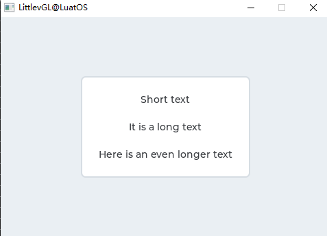
Sample code for the above effect:
    local cont;
    cont = lvgl.cont_create(lvgl.scr_act(), nil);
    lvgl.obj_set_auto_realign(cont, true);                    --Auto realign when the size changes*/
    lvgl.obj_align_origo(cont, nil, lvgl.ALIGN_CENTER, 0, 0);  --This parametrs will be sued when realigned*/
    lvgl.cont_set_fit(cont, lvgl.FIT_TIGHT);
    lvgl.cont_set_layout(cont, lvgl.LAYOUT_COLUMN_MID);

    local label;
    label = lvgl.label_create(cont, nil);
    lvgl.label_set_text(label, "Short text");

    sys.wait(500)

    label = lvgl.label_create(cont, nil);
    lvgl.label_set_text(label, "It is a long text");

    sys.wait(500)

    label = lvgl.label_create(cont, nil);
    lvgl.label_set_text(label, "Here is an even longer text");
Color Chooser(cpicker)#
Overview#
As the name suggests, the color picker allows for the selection of colors. The hue, saturation, and value of the color can be selected in turn.
Widgets are available in two forms: circular (disc) and rectangular.
In both forms, long press on the object and the color picker will change to the next parameter of the color (hue, saturation or value). In addition, double-clicking will reset the current parameters.
Parts and Styles#
The main part of the color picker is called lvgl. CPICKER_PART_BG . In the form of a circle, it uses scale_width to set the width of the circle, and uses pad_inner to fill between the circle and the inner preview circle. In Rectangle mode, the radius can be used to apply a radius on a rectangle.
The object has a virtual part called lvgl. CPICKER_PART_KNOB , which is a rectangle (or circle) drawn on the current value. It uses all rectangles (such as style attributes and padding) to make it larger than the width of a circular or rectangular background.
Usage#
Type#
The type of color picker can be changed using the lvgl.cpicker_ set_type(cpicker, lvgl.CPICKER_ TYPE_RECT/DISC)
Set Color#
Colro can be set manually using lvgl.cpicker_ set_hue/saturation/value(cpicker, x)or all at once using lvgl.cpicker_ set_hsv(cpicker, hsv) or lvgl.cpicker_ set_color(cpicker, rgb)
Color mode#
The current color can be manually selected using the `lvgl.cpicker_ set_color_mode(cpicker, lvgl.CPICKER_ COLOR_MODE_HUE/SATURATION/VALUE).
Use lvgl.cpicker_ set_color_mode_fixed(cpicker, true)to fix color (don`t long press to change)
Knob color#
lvgl.cpicker_set_knob_colored(cpicker, true) Makes the knob automatically display the selected color as the background color.
Event#
Only Common Events (http://lvgl.100ask.net/7.11/documentation/03_overview/03_events.html#id2) are sent by object type.
Learn more about Events (http://lvgl.100ask.net/7.11/documentation/03_overview/03_events.html).
Key#
lvgl.KEY_UP, lvgl.KEY_RIGHT Increases the value of the current parameter 1
lvgl.KEY_DOWN, lvgl.KEY_LEFT Subtract the current parameter 1
lvgl.KEY_ENTER Long press will display the next mode. Double-clicking will reset the current parameters.
Learn more about Keys 。
Example#
Disc color selector#
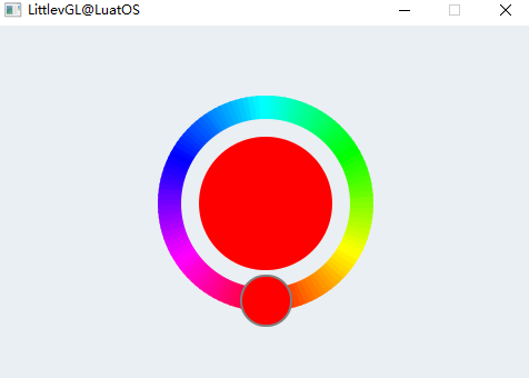
Sample code for the above effect:
    local cpicker
    cpicker = lvgl.cpicker_create(lvgl.scr_act(), nil)
    lvgl.obj_set_size(cpicker, 200, 200)
    lvgl.obj_align(cpicker, nil, lvgl.ALIGN_CENTER, 0, 0)
Drop-down list(dropdown)#
Overview#
The drop-down list allows the user to select a value from the list.
The drop-down list is turned off by default and displays a single value or predefined text. When activated (by clicking the drop-down list), a list is created from which the user can select an option. When the user selects a new value, the list is deleted.
Widgets and Styles#
Call the main part of the drop-down list, lvgl. DROPDOWN_PART_MAIN is a simple lvgl.obj object. It uses all the typical background properties. The press, focus, edit and other ladders also apply as usual.
The list created when you click the main object is Page. Its background part can be quoted, lvgl. DROPDOWN_PART_LIST and use all the typical background properties for the rectangle itself, and text properties for the options. To adjust the spacing between options, use the text_line_space style attribute. The padding value can be used to leave some space on the edge.
The scrollable part of the page is hidden, and its style is always empty (transparent, no padding)。
Scroll bars can be referenced lvgl. DROPDOWN_PART_SCRLBAR and use all the typical background properties.
Can lvgl. DROPDOWN_PART_SELECTED uses all typical background attribute references and uses the selected options. It will draw a rectangle on the selected option in its default state, and draw a rectangle on the pressed option in the pressed state.
Usage#
Set Options#
Options are passed to the drop-down list as a string with lvgl.dropdown_ set_options(dropdown, options). Option applies \nseparation. For example:”First\nSecond\nThird”`. The string will be saved in the drop-down list, so it can also be saved in a local variable.
lvgl.dropdown_add_option(dropdown, "New option", pos) The function inserts a new option into the pos index.
To save memory, you can also use lvgl.dropdown_ set_static_options(dropdown, options)to set options from static (constant) strings. In this case, when there is a drop-down list and the`lvgl. dropdown_ add_option cannot be used, the options string should be active
You can use the lvgl.dropdown_ set_selected(dropdown, id)to manually select an option, where id is the index of the option.
Get Selected Options#
Get the currently selected option using lvgl.dropdown_ get_selected(dropdown). It will return the index of the selected option. lvgl.dropdown_ get_selected_str(dropdown, buf, buf_size)copies the name of the selected option buf 。
Direction#
The list can be created on either side. Default value lvgl. DROPDOWN_DOWN can be modified by function。 lvgl.dropdown_set_dir(dropdown, lvgl.DROPDOWN_DIR_LEFT/RIGHT/UP/DOWN)
If the list is perpendicular to the outside of the screen, it will be aligned to the edge.
Symbol#
Symbols (usually arrows) can be added to the drop-down list using the lvgl.dropdown_ set_symbol(dropdown, lvgl.SYMBOL_...)
If the direction of the drop-down list is lvgl. DROPDOWN_DIR_LEFT , the symbol will be displayed on the left, otherwise it will be displayed on the right.
Maximum height#
You can set the maximum height of the drop-down list through the `lvgl.dropdown_ set_max_height(dropdown, height). By default, it is set to 3/4 vertical resolution.
Show Selected#
The main section can display selected options or static text. This can be controlled using the `lvgl.dropdown_ set_show_selected(dropdown, true/false).
Static text can be set using the `lvgl.dropdown_ set_text(dropdown, “Text”). Only text pointers are saved.
If you also don’t want to highlight the selected option, you can use a custom transparency style lvgl.DROPDOWN_PART_SELECTED 。
Animation time#
The opening/closing animation time of the drop-down list is adjusted by `lvgl.dropdown_ set_anim_time(ddlist, anim_time). An animation time of zero indicates no animation.
Manual opening/closing#
To manually open or close the drop-down list, you can use the lvgl.dropdown_open/close(dropdown, lvgl.ANIM_ON/OFF)function.
Event#
In addition to Common Events, the drop-down list also sends the following Special Events :
lvgl.EVENT_VALUE_CHANGED - Sent when a new option is selected.
Learn more about Events (http://lvgl.100ask.net/7.11/documentation/03_overview/03_events.html).
Key#
The following keys are handled by the button:
lvgl.KEY_RIGHT/DOWN - Select the next option.
lvgl.KEY_LEFT/UP - Select the previous option.
LY_KEY_ENTER - Apply the selected option (send lvgl.EVENT_VALUE_CHANGED event and close the drop-down list)。
Learn more about Keys 。
Example#
Simple drop-down list#
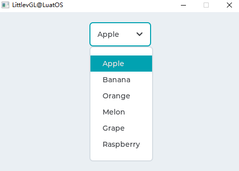
Sample code for the above effect:
--demo1
local function event_handler(obj, event)
    if(event == lvgl.EVENT_VALUE_CHANGED) then
        local buf = lvgl.dropdown_get_selected_str(obj, 20);
        print(string.format("Option: %s\n", buf))
    end
end

--Create a normal drop down list
    local ddlist = lvgl.dropdown_create(lvgl.scr_act(), nil);
    lvgl.dropdown_set_options(ddlist,
[[Apple
Banana
Orange
Melon
Grape
Raspberry]]);

    lvgl.obj_align(ddlist, nil, lvgl.ALIGN_IN_TOP_MID, 0, 20);
    lvgl.obj_set_event_cb(ddlist, event_handler);
Delete the Up list#
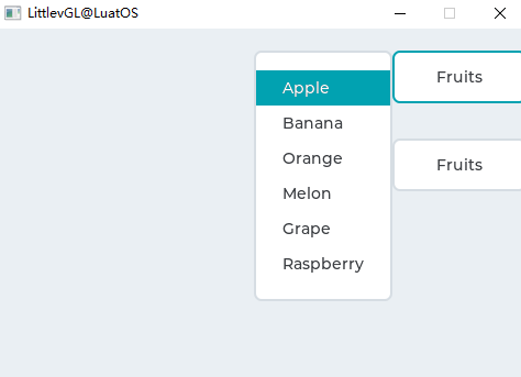
Sample code for the above effect:
    --Create a normal drop down list
    local ddlist = lvgl.dropdown_create(lvgl.scr_act(), nil);
    lvgl.dropdown_set_options(ddlist,
[[Apple
Banana
Orange
Melon
Grape
Raspberry]]);

    lvgl.dropdown_set_dir(ddlist, lvgl.DROPDOWN_DIR_LEFT);
    lvgl.dropdown_set_symbol(ddlist, nil);
    lvgl.dropdown_set_show_selected(ddlist, false);
    lvgl.dropdown_set_text(ddlist, "Fruits");

    --It will be called automatically when the size changes
    lvgl.obj_align(ddlist, nil, lvgl.ALIGN_IN_TOP_RIGHT, 0, 20);

    --Copy the drop LEFT list
    ddlist = lvgl.dropdown_create(lvgl.scr_act(), ddlist);
    lvgl.obj_align(ddlist, nil, lvgl.ALIGN_IN_TOP_RIGHT, 0, 100);
Instrument(gauge)#
Overview#
A gauge is a gauge with a scale label and one or more pointers.
Parts and Styles#
The main part of the meter is called lvgl. GAUGE_PART_MAIN . It draws the background using the typical background style attributes and draws “small” scale lines using the * Line * and * Scale * style attributes. It also uses the * text * attribute to style the scale label. * pad_inner * Used to set the space between the tick mark and the tick label.
lvgl.GAUGE_PART_MAJORIt is a virtual part that uses the * line * and * scale * style attributes to describe the main scale line (where the label is added).
lvgl.GAUGE_PART_NEEDLEIt is also a virtual part, which describes the needle through the * line type * attribute. The * size * and typical background attributes are used to describe the rectangle (or circle) at the pivot point of the needle (s). * pad_inner * Used to make the needle smaller than the outer radius of the scale line.
Usage#
Set value and pin#
The meter can display more than one needle. Use this function to set the number of needles and an array of colors for each needle. Arrays must be static or global variables because only their pointers are stored。lvgl.gauge_set_needle_count(gauge, needle_num, color_array)
You can use to set the value of the needle。lvgl.gauge_set_value(gauge, needle_id, value)
Scale#
You can use this function to adjust the scale angle and the number of tick marks and labels. Default settings are 220 degrees, 6 scale labels, and 21 lines。lvgl.gauge_set_scale(gauge, angle, line_num, label_cnt)
Gauge The scale of can have an offset. Can be adjusted。lvgl.gauge_set_angle_offset(gauge, angle)
Scope#
The range of the gauge can be specified. The default scope is 0..100。lvgl.gauge_set_range(gauge, min, max)
needle image#
The image can also be used as a needle. The image should point to the right (e. g. ==>). To set the image, use. and offset from the rotation center of the upper left corner. The image will be recolored to the color of the needle, and the intensity comes from the style in。lvgl.gauge_set_needle_img(gauge1, &img, pivot_x, pivot_y)``pivot_x``pivot_y``image_recolor_opa``lvgl.GAUGE_PART_NEEDLE
Critical Value#
To set the threshold, use. After this value, the scale color changes to * scale_end_color *. The default threshold is 80。lvgl.gauge_set_critical_value(gauge, value)
Event#
Only Common Events (http://lvgl.100ask.net/7.11/documentation/03_overview/03_events.html#id2) are sent by object type.
Learn more about events.
Key#
The object type does not handle any keys.
Learn more about Key (http://lvgl.100ask.net/7.11/documentation/03_overview/05_indev.html).
Example#
Simple meter#
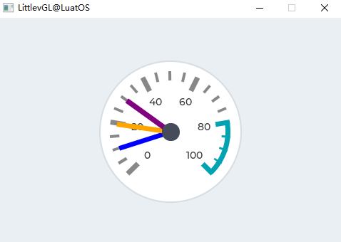
Sample code for the above effect:
    --Describe the color for the needles
    local needle_colors = {lvgl.COLOR_BLUE,lvgl.COLOR_ORANGE,lvgl.COLOR_PURPLE}
    --Create a gauge*/
    local gauge1 = lvgl.gauge_create(lvgl.scr_act(), nil);
    lvgl.gauge_set_needle_count(gauge1, 3, needle_colors);
    lvgl.obj_set_size(gauge1, 200, 200);
    lvgl.obj_align(gauge1, nil, lvgl.ALIGN_CENTER, 0, 0);

    --Set the values*/
    lvgl.gauge_set_value(gauge1, 0, 10);
    lvgl.gauge_set_value(gauge1, 1, 20);
    lvgl.gauge_set_value(gauge1, 2, 30);
Picture(img)#
Overview#
An image is a basic object that is displayed as a file from the outside. Images can also display symbols( lvgl.SYMBOL_... )。
Custom image formats can also be supported using the Image Decoder interface.
Parts and Styles#
There is only one image called lvgl. The main part of IMG_PART_MAIN , which draws the background rectangle and image properties using the typical background style properties. The fill value is used to make the background actually larger. (It does not change the actual size of the image, but only applies the size modification during drawing)
Usage#
Image source#
To provide maximum flexibility, the source of the image can be:
Files stored externally (e. g. files on SD card)。
symbol text.
To use external files, you also need to use the online converter tool to convert the image files, but now you should choose the binary output format. You also need to use the file system module of LVGL, and register drivers with certain functions for basic file operations. Go to the file system to learn more. To set an image from a file, use lvgl.img_set_src(img, "S:folder1/my_img.bin") 。
Symbols can be set similar to tag_. In this case, the image is rendered as text according to the font specified in the style. It can use lightweight monochrome “letters” instead of actual images. Symbols can be set, such lvgl.img_set_src(img1, lvgl.SYMBOL_OK) 。
Label as picture#
Images and labels are sometimes used to convey the same content. For example, describe the function of a button. Thus, the image and the label may be interchanged. To process these images, you can even use lvgl. SYMBOL_DUMMY as a prefix to the text to display the text. For example, lvgl.img_set_src(img, lvgl.SYMBOL_DUMMY "Some text") .
Transparency#
Internal (variable) and external images support 2 transparency processing methods:
Chrome keying - with
lvgl. Pixels COLOR_TRANSP(lvgl.conf.h) color will be transparent.Alpha byte - An alpha byte is added to each pixel.
Palette and Alpha Index#
In addition to the natural (RGB) color format, the following formats are supported:
Indexed - index, the image has a palette.
Alpha indexed - Alpha index, which stores only alpha values.
You can select these options in the font changer. To learn more about color formats, read the images section.
Recolor#
Depending on the brightness of the pixel, the image can be recolored to any color at runtime. It is very useful to display different states of the image (selected, inactive, pressed, etc.) without storing more versions of the same image. Can be passed in lvgl. OPA_TRANSP (no recoloring, value: 0) and lvgl. Set img.intensebetween OPA_COVER(full recoloring, value: 255) to enable the style. The default value is lvgl. OPA_TRANSP , so this feature is disabled.
Automatically resize#
Call the lvgl.img_set_auto_size(image, true)function to automatically set the size of the image object to the width and height of the image source. If automatic resizing is enabled, the object size will change automatically when you set up a new file. Later, you can manually modify the size. If the image is not a screen, auto-resize is enabled by default.
Inlay#
Using lvgl.img_set_offset_x(img, x_ofs) and lvgl.img_set_offset_y(img, y_ofs), you can add some offset to the displayed image. This is useful if the object size is smaller than the image source size. With the offset parameter, you can create a Texture Atlas (https://en.wikipedia.org/wiki/Texture_atlas) or Image on the Run effect by animating (http://lvgl.100ask.net/7.11/documentation/03_overview/10_animation.html) the x or y offset.
Conversion#
Using lvgl.img_set_zoom(img, factor)the image will be scaled. Set factor to 256 or lvgl. IMG_ZOOM_NONE to disable scaling. A larger value will enlarge the image (e. g., 512 times), and a smaller value will reduce the image (e. g., 128 times). Fractional scales also apply. For example: 281 is 10% amplification.
To rotate the image, use lvgl.img_set_angle(img, angle). The angular accuracy is 0.1 degrees, so for the 45.8 ° setting 458。
By default, the pivot point of the rotation is the center of the image. Changes can be made using `lvgl.img_set_pivot(img, pivot_x, pivot_y). 0;0 is the upper left corner.
You can use lvgl.img_set_antialias(img, true/false)to adjust the quality of the conversion. When anti-aliasing is enabled, the quality of the conversion is higher, but the speed is slower.
Conversion requires the entire image to be available. Therefore, you can convert an index image (lvgl.IMG_CF_INDEXED_... ), an alpha-only image (lvgl.IMG_CF_ALPHA_... ), or an image in a file. In other words, the conversion only applies to true color images stored as C arrays, or the custom Image Decoder returns the entire image.
Note that the real coordinates of the image object do not change during the transformation. That is, lvgl.obj_get_width/height/x/y()will return the original non-scaled coordinates.
Rotate#
Image can be rotated
Event#
By default, clicks on image objects are disabled and only regular events related to non-input devices are sent. If you want to capture all the general events of an image object, you should use the following command to enable its click: lvgl.obj_set_click(img, true)
Learn more about events.
Key#
The object type does not handle any keys.
Learn more about Key (http://lvgl.100ask.net/7.11/documentation/03_overview/05_indev.html).
Example#
Image from array#
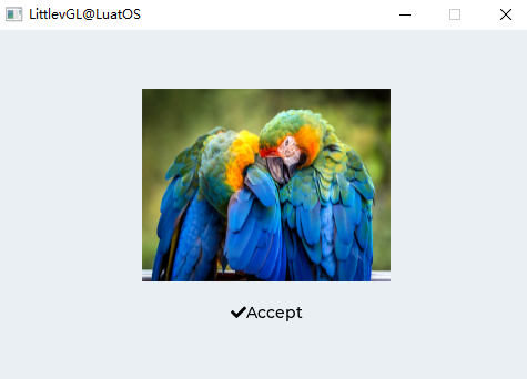
Sample code for the above effect:
    local img1 = lvgl.img_create(lvgl.scr_act(), nil);
    lvgl.img_set_src(img1, "/img/img_cogwheel_argb.png");
    lvgl.obj_align(img1, nil, lvgl.ALIGN_CENTER, 0, -20);

    local img2 = lvgl.img_create(lvgl.scr_act(), nil);
    lvgl.img_set_src(img2, lvgl.SYMBOL_OK.."Accept");
    lvgl.obj_align(img2, img1, lvgl.ALIGN_OUT_BOTTOM_MID, 0, 20);
Picture button(imgbtn)#
Overview#
Image buttons are very similar to simple “button” objects. The only difference is that it displays a user-defined image in each state instead of drawing a rectangle. Before reading this section, read the Buttons section to better understand this section.
Parts and Styles#
The image button object has only one main part, called lvgl. IMG_BTN_PART_MAIN , where all image style properties are used. You can use the image_recolor and image_recolor_opa attributes to recolor the image in each state. For example, if the button is pressed, the image may be dimmed.
Usage#
Image source#
Call the `lvgl.imgbtn_ set_src(imgbtn, lvgl.BTN_STATE_…, & img_src) to set the image to a state. The working principle of the image source is the same as described in Image Object, except that the “Image” button does not support “Symbol.
If lvgl. IMGBTN_TILED , then lvgl.imgbtn_ set_src_tiled(imgbtn, lvgl.BTN_STATE_..., & img_src_left, & img_src_mid, & img_src_right) is available. Using the tiling function, the intermediate image is repeated to fill the width of the object. Thus, for lvgl. IMGBTN_TILED , you can use lvgl.obj_set_width() to set the width of the image button. However, without this option, the width will always be the same as the width of the image source.
Event#
In addition to General Event, the following Special Event is also sent via the button:
lvgl.EVENT_VALUE_CHANGED - Sent when the button is toggled.
Note that events related to generic input devices, such as lvgl.EVENT_PRESSED, are also sent in an inactive state. You need to check the status with lvgl.btn_get_state(btn) to ignore events in inactive buttons.
Learn more about events.
Key#
The following key types are handled by the button:
lvgl.KEY_RIGHT/UP - If switching is enabled, the switching state is entered.
lvgl.KEY_LEFT/DOWN - If switching is enabled, the non-switching state is entered.
Note that, as always, the lvgl.KEY_ENTER state transitions to lvgl.EVENT_PRESSED / PRESSING/RELEASED, etc.
Learn more about Key (http://lvgl.100ask.net/7.11/documentation/03_overview/05_indev.html).
Example#
Simple image button#
Sample code for the above effect:
    --Darken the button when pressed
    -- local lvgl.style_t style;
    local style = lvgl.style_t()
    lvgl.style_init(style);
    lvgl.style_set_image_recolor_opa(style, lvgl.STATE_PRESSED, lvgl.OPA_30);
    lvgl.style_set_image_recolor(style, lvgl.STATE_PRESSED, lvgl.color_make(0x00, 0x00, 0x00));
    lvgl.style_set_text_color(style, lvgl.STATE_DEFAULT, lvgl.color_make(0xFF, 0xFF, 0xFF));

    --Create an Image button
    local imgbtn1 = lvgl.imgbtn_create(lvgl.scr_act(), nil);
    lvgl.imgbtn_set_src(imgbtn1, lvgl.BTN_STATE_RELEASED, "/img/imgbtn_green.png");
    lvgl.imgbtn_set_src(imgbtn1, lvgl.BTN_STATE_PRESSED, "/img/imgbtn_green.png");
    lvgl.imgbtn_set_src(imgbtn1, lvgl.BTN_STATE_CHECKED_RELEASED, "/img/imgbtn_blue.png");
    lvgl.imgbtn_set_src(imgbtn1, lvgl.BTN_STATE_CHECKED_PRESSED, "/img/imgbtn_blue.png");
    lvgl.imgbtn_set_checkable(imgbtn1, true);
    lvgl.obj_add_style(imgbtn1, lvgl.IMGBTN_PART_MAIN, style);
    lvgl.obj_align(imgbtn1, nil, lvgl.ALIGN_CENTER, 0, -40);

    --Create a label on the Image button
    local label = lvgl.label_create(imgbtn1, nil);
    lvgl.label_set_text(label, "Button");
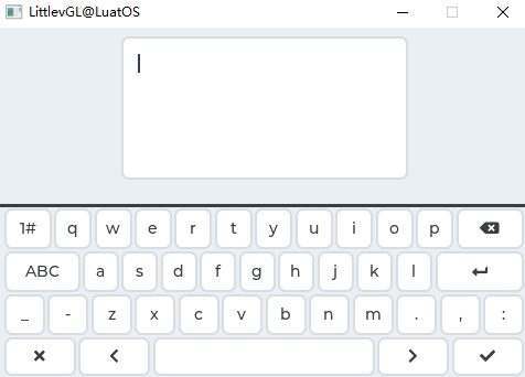
Keyboard(keyboard)#
Overview#
Keyboard The object is a special button matrix (lvgl.imgbtn) with predefined key mapping and other functions to implement a virtual keyboard to write text.
Parts and Styles#
Similar to Button matices, the keyboard consists of 2 parts:
lvgl.KEYBOARD_PART_BGThis is the main part and uses all the typical background propertieslvgl.KEYBOARD_PART_BTNThis is the virtual part of the button. It also uses all the typical background properties and text properties.
Usage#
Mode#
The keyboard has the following modes:
lvgl.KEYBOARD_MODE_TEXT_LOWER - Show lowercase letters
lvgl.KEYBOARD_MODE_TEXT_UPPER - Show uppercase letters
lvgl.KEYBOARD_MODE_TEXT_SPECIAL - Show Special Characters
lvgl.KEYBOARD_MODE_NUM - Displays numbers, /-signs and decimal points.
The layout of the text mode (TEXT) contains buttons to change the mode.
To set the mode manually, use lvgl.keyboard_ set_mode(kb, mode). The default is more lvgl.KEYBOARD_MODE_TEXT_UPPER 。
Assign Text Area#
The keyboard can be assigned a Text area (http://lvgl.100ask.net/7.11/documentation/04_widgets/documentation/04_widgets/32_textarea.html) to automatically place the clicked character there. To assign a text area, use lvgl.keyboard_set_textarea(kb, ta) 。
The cursor of the assigned text area can be managed by the keyboard: after the keyboard is assigned, the cursor of the previous text area will be hidden and the new text area will be displayed. When the keyboard is closed via the OK or Close button, the cursor will also be hidden. The cursor manager functionality is enabled by ``lvgl. keyboard_ set_cursor_manage(kb, true). The default is Do Not Manage.
New Keyboard Layout#
You can use lvgl.keyboard_ set_map(kb, map)and lvgl.keyboard_ set_ctrl_map(kb, ctrl_map) to specify a new map (layout) for the keyboard. Learn more about Button Matrix (lvgl.imgbtn) (http://lvgl.100ask.net/7.11/documentation/04_widgets/05_btnmatrix.html). Remember, using the following keywords will have the same effect as the original map:
Event#
In addition to Common Events, the keyboard supports the following Special Events :
lvgl.EVENT_VALUE_CHANGED - Send when the button is pressed/released, or repeat after long press. The event data is set to the button press/release ID。
lvgl.EVENT_APPLY - OK Button is clicked
lvgl.EVENT_CANCEL - Close button is clicked
The keyboard has a default event handler callback called the lvgl.keyboard_ def_event_cb. It handles button presses, map changes, assigned text areas, etc. It can be completely replaced with a custom event handler, but the lvgl.keyboard_ def_event_cb can be called at the beginning of the event handler to handle the same operations as before.
Learn more about events.
Key#
The keyboard can handle the following keys:
lvgl.KEY_RIGHT/UP/LEFT/RIGHT - To navigate between the buttons and select one.
lvgl.KEY_ENTER - Press/release the selected button.
Learn more about Key (http://lvgl.100ask.net/7.11/documentation/03_overview/05_indev.html).
Example#
Keyboard with text area#
Sample code for the above effect:
local keyboard = {}

local  kb
local  ta

local function kb_event_cb(keyboard, e)
    if e == lvgl.EVENT_DELETE then return end
    lvgl.keyboard_def_event_cb(kb, e);
    if(e == lvgl.EVENT_CANCEL) then
        lvgl.keyboard_set_textarea(kb, nil);
        lvgl.obj_del(kb);
        kb = nil
    end
end

local function kb_create()
    kb = lvgl.keyboard_create(lvgl.scr_act(), nil);
    lvgl.keyboard_set_cursor_manage(kb, true);
    lvgl.obj_set_event_cb(kb, kb_event_cb);
    lvgl.keyboard_set_textarea(kb, ta);
end

local function ta_event_cb(ta_local, e)
    if(e == lvgl.EVENT_CLICKED and kb == nil) then
        kb_create()
    end
end

function keyboard.demo()
    --Create a text area. The keyboard will write here
    ta  = lvgl.textarea_create(lvgl.scr_act(), nil);
    lvgl.obj_align(ta, nil, lvgl.ALIGN_IN_TOP_MID, 0, lvgl.DPI / 16);
    lvgl.obj_set_event_cb(ta, ta_event_cb);
    lvgl.textarea_set_text(ta, "");
    local lvgl.VER_RES = lvgl.disp_get_ver_res(lvgl.disp_get_default())
    local max_h = lvgl.VER_RES / 2 - lvgl.DPI / 8;
    if(lvgl.obj_get_height(ta) > max_h) then lvgl.obj_set_height(ta, max_h)end;

    kb_create();
end

return keyboard
Label(label)#
Overview#
Labels are the basic object type used to display text.
Parts and Styles#
The label has only one main part, called lvgl. LABEL_PART_MAIN . It uses all the typical background properties and text properties. The padding value can be used to make the area of the text smaller in the relevant direction.
Usage#
Set Text#
You can use lvgl.label_set_text(label, "New text")to set the text on the label at run time. It will dynamically allocate a buffer and copy the supplied string into that buffer. Therefore, there is no need to keep the text passed to `lvgl.label_set_text in the scope after the function returns.
Use lvgl.label_set_text_fmt(label, "Value: %d", 15)to format the text with printf.
The label is able to display text from a 0 terminated static character buffer. To do this, use lvgl.label_set_static_text(label, "Text"). In this case, the text is not stored in dynamic memory, but directly uses the given buffer. This means that the array cannot be a local variable that goes out of scope when the function exits. The constant string can be safely used with lvgl.label_set_static_text (unless with lvgl. LABEL_LONG_DOT are used together because it can modify the buffer in place), because they are stored in ROM memory, which is always accessible.
You can also use the original array as the label text. Arrays do not have to be terminated with \0. In this case, the text will be saved to dynamic memory like lvgl. set_text_label. To set the original character array, use the lvgl.label_set_array_text(label, char_array, size)function.
Cross the line#
Line breaks are handled automatically by the label object. You can use \n to wrap the line. For example: "line1\nline2\n\nline4"
Long mode#
By default, the width of the label object automatically expands to the text size. Otherwise, the text can be manipulated according to several long pattern strategies:
lvgl.LABEL_LONG_EXPAND - Expands object size to text size (default)
lvgl.LABEL_LONG_BREAK - Maintain object width, break (wrap) overly long lines, and expand object height
lvgl.LABEL_LONG_DOT - Keep the object size, break the text and write the dot on the last line (not supported when using
lvgl.label_set_static_text)lvgl.LABEL_LONG_SROLL - Keep size and scroll labels back and forth
lvgl.LABEL_LONG_SROLL_CIRC - Keep size and cycle through labels
lvgl.LABEL_LONG_CROP - Keep size and crop text
Long mode can be specified using lvgl.label_set_long_mode(label, lvgl.LABEL_LONG_...)
It is important to note that when you create a label and set its text, the size of the label is expanded to the text size. In addition to the default lvgl. LABEL_LONG_EXPAND , the long pattern lvgl.obj_set_width/height/size() is invalid.
Therefore, you need to change the long mode, first set the new long mode, and then use lvgl. obj_l/height/size()to set_width the size.
Another important note is lvgl. LABEL_LONG_DOT manipulate the text buffer in place to add/remove points. When using lvgl.label_set_text or lvgl.label_set_array_text , a separate buffer will be allocated, and the implementation details will not be noticed. lvgl.label_set_static_text Not so! If you plan to use lvgl. LABEL_LONG_DOT , the buffer passed to lvgl.label_set_static_text` must be writable.
Text Alignment#
Lines of text can be aligned left and right using `lvgl.label_set_align(label, lvgl.LABEL_ALIGN_LEFT/RIGHT/CENTER). Note that it will align only the lines, not the label object itself.
The label itself does not support vertical alignment; you should place the label in a larger container and then align the entire label object.
Text Recolor#
In text, you can use the command to recolor portions of text. For example: "Write a #ff0000 red# word". This feature can be enabled separately for each set_recolor via the lvgl.label_label ()function.
Note that recoloring can only be done on one line. Therefore, \n should not be used in recolored text, or with lvgl. LABEL_LONG_BREAK newline, otherwise, the text in the new line will not be recolored.
a very long text#
Lvgl Very long characters (> 40k characters) can be handled efficiently by saving some extra data (~ 12 bytes) to speed up the drawing. To enable this feature, set lvgl.LABEL_LONG_TXT_HINT 1
Symbol#
Labels can display symbols next to letters (or separately). Read the font section to learn more about symbols.
Event#
Only Common Events (http://lvgl.100ask.net/7.11/documentation/03_overview/03_events.html#id2) are sent by object type.
Learn more about events.
Key#
The object type does not handle any keys.
Learn more about Key (http://lvgl.100ask.net/7.11/documentation/03_overview/05_indev.html).
Example#
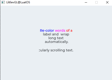
Recolor and scroll labels#
Sample code for the above effect:
local label_demo = {}

function label_demo.demo()
    local label1 = lvgl.label_create(lvgl.scr_act(), nil);
    lvgl.label_set_long_mode(label1, lvgl.LABEL_LONG_BREAK);     --Break the long lines
    lvgl.label_set_recolor(label1, true);                      --Enable re-coloring by commands in the text
    lvgl.label_set_align(label1, lvgl.LABEL_ALIGN_CENTER);       --Center aligned lines
    lvgl.label_set_text(label1, "#0000ff Re-color# #ff00ff words# #ff0000 of a# label and  wrap long text automatically.");
    lvgl.obj_set_width(label1, 150);
    lvgl.obj_align(label1, nil, lvgl.ALIGN_CENTER, 0, -30);

    local label2 = lvgl.label_create(lvgl.scr_act(), nil);
    lvgl.label_set_long_mode(label2, lvgl.LABEL_LONG_SROLL_CIRC);     --Circular scroll
    lvgl.obj_set_width(label2, 150);
    lvgl.label_set_text(label2, "It is a circularly scrolling text. ");
    lvgl.obj_align(label2, nil, lvgl.ALIGN_CENTER, 0, 30);
end

return label_demo
LED(led)#
Overview#
LED is a rectangular (or circular) object. Its brightness can be adjusted. When the brightness decreases, the color of the LED becomes darker.
Parts and Styles#
LED There is only one main part, called lvgl. LED_PART_MAIN , which uses all the typical background style properties.
Usage#
Brightness#
You can use lvgl.led_set_bright(led, bright)to set their brightness. The brightness should be between 0 (darkest) and 255 (brightest).
Switch#
Use lvgl.led_on(led)and lvgl.led_off(led) to set the brightness to a predefined ON or OFF value. lvgl.led_toggle(led)toggles between ON and OFF states.
Event#
Only common events are supported
Learn more about events.
Key handling#
The object type does not handle any keys.
Learn more about Key (http://lvgl.100ask.net/7.11/documentation/03_overview/05_indev.html).
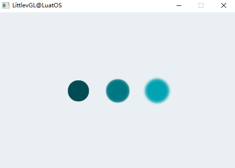
Example#
Custom style LED#
Sample code for the above effect:
local led_demo = {}

function led_demo.demo()
    --Create a LED and switch it OFF
    local led1  = lvgl.led_create(lvgl.scr_act(), nil);
    lvgl.obj_align(led1, nil, lvgl.ALIGN_CENTER, -80, 0);
    lvgl.led_off(led1);

    --Copy the previous LED and set a brightness
    local led2  = lvgl.led_create(lvgl.scr_act(), led1);
    lvgl.obj_align(led2, nil, lvgl.ALIGN_CENTER, 0, 0);
    lvgl.led_set_bright(led2, 190);

    --Copy the previous LED and switch it ON
    local led3  = lvgl.led_create(lvgl.scr_act(), led1);
    lvgl.obj_align(led3, nil, lvgl.ALIGN_CENTER, 80, 0);
    lvgl.led_on(led3);
end

return led_demo
Line(line)#
Overview#
Line An object can draw a line between a set of points.
Parts and Styles#
The line has only one main section, called lvgl. LABEL_PART_MAIN . It uses all linetype attributes.
Usage#
Set Point#
These points must be stored in the lvgl.point_t array and passed to the object through the lvgl.line_set_points(lines, point_array, point_cnt)function.
Auto Size#
You can automatically set the size of a line object based on its points. It can be enabled using the lvgl.line_set_auto_size(line, true)function. If on, after setting points, changes the width and height of the object based on the maximum x and y coordinates between the points. By default, automatic sizing is enabled.
Inverted y#
By default, the y = = 0 point is at the top of the object. In some cases it may be intuitive, so you can use lvgl.line_set_y_invert(line, true)to reverse the y coordinate. In this case, y = = 0 will be the bottom of the object. By default, y inversion is disabled.
Event#
Only common events are supported 。
Learn more about events.
Key handling#
The object type does not handle any keys.
Learn more about Key (http://lvgl.100ask.net/7.11/documentation/03_overview/05_indev.html).
Example#
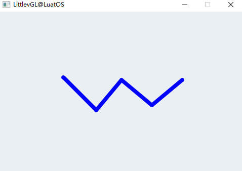
Simple Line#
Sample code for the above effect:
local line_demo = {}

function line_demo.demo()
    --Create an array for the points of the line
    local line_points = { {5, 5}, {70, 70}, {120, 10}, {180, 60}, {240, 10} };

    --Create style
    local style_line = lvgl.style_t();
    lvgl.style_init(style_line);
    lvgl.style_set_line_width(style_line, lvgl.STATE_DEFAULT, 8);
    lvgl.style_set_line_color(style_line, lvgl.STATE_DEFAULT, lvgl.color_make(0x00, 0x00, 0xFF));
    lvgl.style_set_line_rounded(style_line, lvgl.STATE_DEFAULT, true);

    --Create a line and apply the new style
    local line1;
    line1 = lvgl.line_create(lvgl.scr_act(), nil);
    lvgl.line_set_points(line1, line_points, 5);     --Set the points
    lvgl.obj_add_style(line1, lvgl.LINE_PART_MAIN, style_line);     --Set the points
    lvgl.obj_align(line1, nil, lvgl.ALIGN_CENTER, 0, 0);
end

return line_demo
List(list)#
Overview#
The list is constructed from the background Page and the Buttons on it. The button contains an optional icon-like Image (can also be a symbol) and ](http://lvgl.100ask.net/7.11/documentation/04_widgets/20_list.html#id2) Label [_. When the list is long enough, you can scroll it.
Parts and Styles#
List has the same section as Page
lvgl.LIST_PART_BGlvgl.LIST_PART_SCRLlvgl.LIST_PART_SCRLBARlvgl.LIST_PART_EDGE_FLASH
See the Page section for more information.
Buttons on the list are treated as normal buttons, they have only one main part, called lvgl.BTN_PART_MAIN 。
Usage#
Layout#
By default, the list is vertical. To get a list of levels, use lvgl.list_set_layout(list, lvgl.LAYOUT_ROW_MID) 。
Edge flicker#
When the list reaches the highest or lowest position, a circle-like effect can be displayed. lvgl.list_set_edge_flash(list, true)enables this feature.
Rolling Propagation#
If the list is created on another scrollable element, such as a Page, and the list cannot be scrolled further, scrolling can be propagated to the parent. This way, scrolling will continue on the parent. It can be enabled via lvgl.list_set_scroll_propagation(list,true)
Event#
Only common events are supported 。
Learn more about events.
Key handling#
List handles the following keys:
lvgl.KEY_RIGHT/DOWN Select Next Button
lvgl.KEY_LEFT/UP Select previous button
Please note that, as always, lvgl. The state of KEY_ENTER will change to lvgl. EVENT_PRESSED/PRESSING/RELEASED etc.
The selected button is in lvgl. BTN_STATE_PR/TG_PR status.
To manually select a button, use lvgl.list_set_btn_selected(list, btn). When the list is defocused and focused again, it will restore the last selected button.
Learn more about Key (http://lvgl.100ask.net/7.11/documentation/03_overview/05_indev.html).
Example#
Simple List#
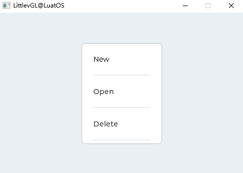
Sample code for the above effect:
local list_demo = {}

local function event_handler(obj, event)
    if(event == lvgl.EVENT_CLICKED) then
        print(string.format("Clicked: %s\n", lvgl.list_get_btn_text(obj)));
    end
end

function list_demo.demo()
    --Create a list
    local list1 = lvgl.list_create(lvgl.scr_act(), nil);
    lvgl.obj_set_size(list1, 160, 200);
    lvgl.obj_align(list1, nil, lvgl.ALIGN_CENTER, 0, 0);

    --Add buttons to the list
    local list_btn;

    list_btn = lvgl.list_add_btn(list1, lvgl.SYMBOL_FILE, "New");
    lvgl.obj_set_event_cb(list_btn, event_handler);

    list_btn = lvgl.list_add_btn(list1, lvgl.SYMBOL_DIRECTORY, "Open");
    lvgl.obj_set_event_cb(list_btn, event_handler);

    list_btn = lvgl.list_add_btn(list1, lvgl.SYMBOL_CLOSE, "Delete");
    lvgl.obj_set_event_cb(list_btn, event_handler);

    list_btn = lvgl.list_add_btn(list1, lvgl.SYMBOL_EDIT, "Edit");
    lvgl.obj_set_event_cb(list_btn, event_handler);

    list_btn = lvgl.list_add_btn(list1, lvgl.SYMBOL_SAVE, "Save");
    lvgl.obj_set_event_cb(list_btn, event_handler);

    list_btn = lvgl.list_add_btn(list1, lvgl.SYMBOL_BELL, "Notify");
    lvgl.obj_set_event_cb(list_btn, event_handler);

    list_btn = lvgl.list_add_btn(list1, lvgl.SYMBOL_BATTERY_FULL, "Battery");
    lvgl.obj_set_event_cb(list_btn, event_handler);
end

return list_demo
Gauge (arc scale)(lmeter)#
Overview#
A line table object consists of radial lines drawn to scale. Setting the value of the line table changes the color of the tick marks proportionally.
Parts and Styles#
The line table has only one main part, called lvgl. LINEMETER_PART_MAIN . It draws a rectangular or circular background using all the typical background properties, and draws proportional lines using the line and scale properties. The color of the active row (associated with the smaller value, the current value) ranges from line_color to scale_grad_color. The last (after the current value) row is set scale_end_color color。
Usage#
Set Value#
When you set a new value with lvgl.linemeter_ set_value(linemeter, new_value), the scale part of the scale will be recolored.
Range and Angle#
lvgl.linemeter_set_range(linemeter, min, max) The function sets the range of the line table.
The angle and number of lines of the scale can be set through the `lvgl.linemeter_ set_scale(linemeter, angle, line_num). The default angle is 240 and the default line number is 31。
Angle Offset#
By default, the scale angle is interpreted symmetrically with respect to the y-axis. This results in a “standing” line table. Use the `lvgl.linemeter_ set_angle_offset to add an offset to the zoom angle. It can be used, for example, to put a 1/4 line table to the corner or a half line table to the right or left.
Mirror#
By default, the lines of the line table are activated clockwise. This can be changed using the `lvgl.linemeter_ set_mirror(linemeter, true/false).
Event#
Only common events are supported 。
Learn more about events.
Key handling#
The object type does not handle any keys.
Learn more about Key (http://lvgl.100ask.net/7.11/documentation/03_overview/05_indev.html).
Example#
Simple meter#
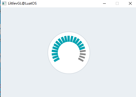
Sample code for the above effect:
local lmeter_demo = {}

function lmeter_demo.demo()
    --Create a line meter
    local lmeter;
    lmeter = lvgl.linemeter_create(lvgl.scr_act(), nil);
    lvgl.linemeter_set_range(lmeter, 0, 100);                   --Set the range
    lvgl.linemeter_set_value(lmeter, 80);                       --Set the current value
    lvgl.linemeter_set_scale(lmeter, 240, 21);                  --Set the angle and number of lines
    lvgl.obj_set_size(lmeter, 150, 150);
    lvgl.obj_align(lmeter, nil, lvgl.ALIGN_CENTER, 0, 0);
end

return lmeter_demo
Message Box(msdbox)#
Overview#
The message box acts as a pop-up window. They are built from background containers, labels, and button matrix (lvgl.imgbtn) of buttons.
The text will be automatically divided into multiple lines (with lvgl. LABEL_LONG_MODE_BREAK ), the height will be automatically set to contain text and buttons (lvgl. FIT_TIGHT Place vertically)-
Parts and Styles#
The main part of the message box is called lvgl. MSGBOX_PART_MAIN , which uses all the typical background style properties. Using a fill increases the space on the side. pad_inner will add a space between the text and the button. Label style properties affect the text style.
The button part is the same as the case of Button Matrix (lvgl.imgbtn):
lvgl.MSGBOX_PART_BTN_BGBackground of the buttonlvgl.MSGBOX_PART_BTNButton
Usage#
Set Text#
To set the text, use the lvgl.msgbox_ set_text(msgbox, "My text")function. Not only will the text pointer be saved, but the text can also be in a local variable.
Add button#
To add a button, use the lvgl.msgbox_ add_btns(msgbox, btn_str)function. The text of the button needs to be specified, for example const char * btn_str[] = {"Apply", "Close", ""}. For more information, visit the Button Matrix documentation.
Auto Close#
Use the lvgl.msgbox_ start_auto_close(mbox, delay)to automatically close the message box after the animation delay for a few milliseconds. The lvgl.mbox_stop_auto_close(mbox)function stops the automatic shutdown of the start.
The duration of the closing animation can be set via `lvgl.mbox_set_anim_time(mbox, anim_time).
Event#
In addition to Common Events, the checkbox supports the following Special Events :
lvgl.EVENT_VALUE_CHANGED Sent when the button is clicked. The event data is set to the button clicked ID。
The message box has a default event callback that closes itself when the button is clicked.
Learn more about events.
Key handling#
The message box can handle the following keys:
lvgl.KEY_RIGHT/DOWN Select Next Button
lvgl.KEY_LEFT/TOP Select previous button
lvgl.KEY_ENTER Click the selected button
Learn more about Key (http://lvgl.100ask.net/7.11/documentation/03_overview/05_indev.html).
Example#
Simple Message Box#
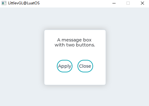
Sample code for the above effect:
local msdbox_demo = {}

local function event_handler(obj, event)
    if(event == lvgl.EVENT_VALUE_CHANGED) then
        print(string.format("Button: %s\n", lvgl.msgbox_get_active_btn_text(obj)));
    end
end

function msdbox_demo.demo()
    local  btns ={"Apply", "Close", ""};

    local mbox1 = lvgl.msgbox_create(lvgl.scr_act(), NULL);
    lvgl.msgbox_set_text(mbox1, "A message box with two buttons.");
    lvgl.msgbox_add_btns(mbox1, btns);----
    lvgl.obj_set_width(mbox1, 200);
    lvgl.obj_set_event_cb(mbox1, event_handler);
    lvgl.obj_align(mbox1, nil, lvgl.ALIGN_CENTER, 0, 0); --Align to the corner
end

return msdbox_demo
Object Mask(objmask)#
Overview#
Object Mask You can add some masks to drawing objects.
Parts and Styles#
The object mask has only one main part lvgl. OBJMASK_PART_BG , which uses typical background style properties.
Usage#
Add Mask#
The mask should be initialized before adding a mask to the * object mask *:
    lvgl.draw_mask_<type>_param_t mask_param;
    lvgl.draw_mask_<type>_init(&mask_param, ...);
    lvgl.objmask_mask_t * mask_p = lvgl.objmask_add_mask(objmask, &mask_param);
Lvgl The following mask types are supported:
lineClip Lines Top/Bottom Left/Right Pixels. can be initialized from two points or a point and an angle:
**Angle **only keeps pixels between the given start and end angles
**Radius **keeps pixels only inside a rectangle that can have a radius (can also be used for circles). It can be reversed to keep the pixels outside the rectangle.
Vertical fade in fade out (change pixel opacity based on their y position)
mapUse an alpha mask (an array of bytes) to describe the opacity of a pixel.
The coordinates in the mask are relative to the object. That is, if the object moves, the mask moves with it.
For more information about the mask * init * function, see the API documentation below.
Update Mask#
You can use to update the existing mask, where the return value is。lvgl.objmask_update_mask(objmask, mask_p, new_param)``mask_p``lvgl.objmask_add_mask
Removing the mask#
The mask can be removed using the following methods lvgl.objmask_remove_mask(objmask, mask_p)
Event#
Object type sends only common events。
Learn more about event’s.
Key handling#
Object type does not handle any * key information*。
Learn more about Key (https://docs.lvgl.io/latest/en/html/overview/indev.html).
Example#
several object masks#
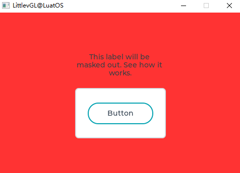
Sample code:
local objmask_demo = {}

function objmask_demo.demo()
    --Set a very visible color for the screen to clearly see what happens*/
    lvgl.obj_set_style_local_bg_color(lvgl.scr_act(), lvgl.OBJ_PART_MAIN, lvgl.STATE_DEFAULT, lvgl.color_hex3(0xf33));

    local om = lvgl.objmask_create(lvgl.scr_act(), nil);
    lvgl.obj_set_size(om, 200, 200);
    lvgl.obj_align(om, nil, lvgl.ALIGN_CENTER, 0, 0);
    local label = lvgl.label_create(om, nil);
    lvgl.label_set_long_mode(label, lvgl.LABEL_LONG_BREAK);
    lvgl.label_set_align(label, lvgl.LABEL_ALIGN_CENTER);
    lvgl.obj_set_width(label, 180);
    lvgl.label_set_text(label, "This label will be masked out. See how it works.");
    lvgl.obj_align(label, nil, lvgl.ALIGN_IN_TOP_MID, 0, 20);

    local cont = lvgl.cont_create(om, nil);
    lvgl.obj_set_size(cont, 180, 100);
    lvgl.obj_set_drag(cont, true);
    lvgl.obj_align(cont, nil, lvgl.ALIGN_IN_BOTTOM_MID, 0, -10);

    local btn = lvgl.btn_create(cont, nil);
    lvgl.obj_align(btn, nil, lvgl.ALIGN_CENTER, 0, 0);
    lvgl.obj_set_style_local_value_str(btn, lvgl.BTN_PART_MAIN, lvgl.STATE_DEFAULT, "Button");

    lvgl.refr_now(nil);
    sys.wait(1000)

    local a = lvgl.area_t()
    local r1 = lvgl.draw_mask_radius_param_t()
    a.x1 = 10;
    a.y1 = 10;
    a.x2 = 190;
    a.y2 = 190;
    -- lvgl.draw_mask_radius_init(r1, a, lvgl.RADIUS_CIRCLE, false);
    lvgl.draw_mask_radius_init(r1, a, 0x7FFF, false);
    lvgl.objmask_add_mask(om, r1);

    lvgl.refr_now(nil);
    sys.wait(1000)

    a.x1 = 100;
    a.y1 = 100;
    a.x2 = 150;
    a.y2 = 150;
    -- lvgl.draw_mask_radius_init(r1, a, lvgl.RADIUS_CIRCLE, true);
    lvgl.draw_mask_radius_init(r1, a, 0x7FFF, false);
    lvgl.objmask_add_mask(om, r1);

    lvgl.refr_now(nil);
    sys.wait(1000)

    local l1 = lvgl.draw_mask_line_param_t()
    lvgl.draw_mask_line_points_init(l1, 0, 0, 100, 200, lvgl.DRAW_MASK_LINE_SIDE_TOP);
    lvgl.objmask_add_mask(om, l1);

    lvgl.refr_now(nil);
    sys.wait(1000)

    local f1 = lvgl.draw_mask_fade_param_t()
    a.x1 = 100;
    a.y1 = 0;
    a.x2 = 200;
    a.y2 = 200;
    -- lvgl.draw_mask_fade_init(f1, a, lvgl.OPA_TRANSP, 0, lvgl.OPA_COVER, 150);
    lvgl.draw_mask_fade_init(f1, a, 0, 0, 255, 150);
    lvgl.objmask_add_mask(om, f1);
end

return objmask_demo
Page(page)#
Overview#
The page consists of two interconnected containers:
A background
**Scrollable **at the top.
Parts and Styles#
The main part of the page is called the lvgl of the page. PAGE_PART_BG background. It uses all the typical background style attributes. Using a fill increases the space on both sides.
You can pass lvgl. PAGE_PART_SCRL part references a scrollable object. It also uses all the typical background style attributes and padding to increase the space on both sides.
lvgl.LIST_PART_SCROLLBARis the virtual part of the background that is used to draw the scroll bar. Use all the typical background style properties, * size * to set the width of the scroll bar, and * pad_right * and * pad_bottom * to set the spacing.
lvgl.LIST_PART_EDGE_FLASHAlso the virtual part of the background, when the list cannot be scrolled further in that direction, draw a semicircle on the side. Use all the typical background properties.
Usage#
Background objects can be referenced just like the page itself. For example to set the width of the page:.lvgl.obj_set_width(page, 100)
If a child is created on the page, it is automatically moved to the scrollable container. If the scrollable container becomes larger, you can scroll the background by dragging (such as the list on a smartphone)。
By default, scrollable lvgl. FIT_MAX fits in all directions. This means that when the children are in the background, the scrollable size will be the same as the size of the background (minus padding). But when an object is outside the background, the scrollable size will increase to relate to it.
Scroll bar#
Scroll bars can be displayed according to four strategies:
lvgl.SCRLBAR_MODE_OFFNever show scroll barslvgl.SCRLBAR_MODE_ONAlways show scroll barlvgl.SCRLBAR_MODE_DRAGShow scroll bars when dragging a pagelvgl.SCRLBAR_MODE_AUTOShow scrollbars when scrollable container is large enough to scrolllvgl.SCRLBAR_MODE_HIDETemporarily hide scroll barslvgl.SCRLBAR_MODE_UNHIDEUnhides previously hidden scroll bars. also restore the original model
The scroll bar display policy can be changed in the following ways:. The default value is。lvgl.page_set_scrlbar_mode(page, SB_MODE)``lvgl.SCRLBAR_MODE_AUTO
Glue Object#
A child can be “glued” to the page. In this case, if you can scroll the page by dragging the object. It can pass.lvgl.page_glue_obj(child, true)
Focus Object#
Objects on the page can be focused. It moves the scrollable container to display the children. The time of the animation can be set in milliseconds. It does not have to be a direct child of the page. This method is valid if the scrollable object is also the grandparent of that object。lvgl.page_focus(page, child, lvgl.ANIM_ONO/FF)``lvgl.page_set_anim_time(page, anim_time)``child
Manual Navigation#
You can manually move scrollable objects using andlvgl.page_scroll_hor(page, dist)``lvgl.page_scroll_ver(page, dist)
Edge Flash#
If the list reaches the most top/bottom/left/right position, a circular-like effect can be displayed. Enable this feature。lvgl.page_set_edge_flash(list, en)
Rolling Propagation#
If the list is created on other scrollable elements (such as other pages), and the page cannot be scrolled further, scrolling can be propagated to the parent to continue scrolling on the parent. It can enablelvgl.page_set_scroll_propagation(list, true)
Clean up the page#
All objects created on the page can use lvgl.page_clean(page). Please note that lvgl.obj_clean(page) does not work here because it will also delete scrollable objects.
Scrollable API#
There are functions that directly set/get scrollable properties:
lvgl.page_get_scrl()lvgl.page_set_scrl_fit/fint2/fit4()lvgl.page_set_scrl_width()lvgl.page_set_scrl_height()lvgl.page_set_scrl_fit_width()lvgl.page_set_scrl_fit_height()lvgl.page_set_scrl_layout()
Event#
Object type sends only common events。
Scrollable objects have a default event callback that propagates the following events to the background object: lvgl.EVENT_PRESSED, lvgl.EVENT_PRESSING, lvgl.EVENT_PRESS_LOST, lvgl.EVENT_RELEASED, lvgl.EVENT_SHORT_CLICKED, lvgl.EVENT_CLICKED, lvgl.EVENT_LONG_PRESSED,lvgl.EVENT_LONG_PRESSED_REPEAT
Learn more about event’s.
Key handling#
The following * Keys * are handled by Page:
lvgl.KEY_RIGHT/LEFT/UP/DOWNScroll Page
Learn more about Key’s.
Example#
Page with Scroll Bar#
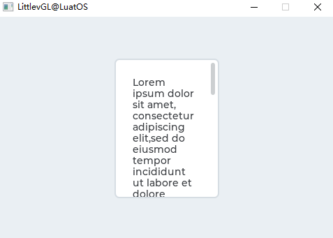
Sample code for the above effect:
local page_demo = {}

function page_demo.demo()
    --Create a page
    local page = lvgl.page_create(lvgl.scr_act(), nil);
    lvgl.obj_set_size(page, 150, 200);
    lvgl.obj_align(page, nil, lvgl.ALIGN_CENTER, 0, 0);

    --Create a label on the page
    local label = lvgl.label_create(page, nil);
    lvgl.label_set_long_mode(label, lvgl.LABEL_LONG_BREAK);            --Automatically break long lines
    lvgl.obj_set_width(label, lvgl.page_get_width_fit(page));          --Set the label width to max value to not show hor. scroll bars
    lvgl.label_set_text(label,
[[Lorem ipsum dolor sit amet, consectetur adipiscing elit,sed do eiusmod tempor incididunt ut labore et dolore magna aliqua.
Ut enim ad minim veniam, quis nostrud exercitation ullamco
laboris nisi ut aliquip ex ea commodo consequat. Duis aute irure
dolor in reprehenderit in voluptate velit esse cillum dolore
eu fugiat nulla pariatur.
Excepteur sint occaecat cupidatat non proident, sunt in culpa
qui officia deserunt mollit anim id est laborum.]]);
end

return page_demo
Roller(roller)#
Overview#
The roller allows one option to be selected from a plurality of options simply by scrolling.
Parts and Styles#
The main part of the drum is called lvgl. ROLLER_PART_BG . It is a rectangle and uses all the typical background properties. The style of the Roller tag is inherited from the text style property of the background. To adjust the spacing between options, use the text_line_space style attribute. The fill style property sets the space on the side.
The selected option in the middle can be used lvgl. ROLLER_PART_SELECTED virtual part reference. In addition to the typical background properties, it also uses the text properties to change the appearance of the text in the selected area.
Usage#
Set Options#
These options are passed to Roller as a string with the lvgl.roller_ set_options(roller, options, lvgl.ROLLER_ MODE_NORMAL/INFINITE). Option applies \nseparation. For example:”First\nSecond\nThird”` 。
lvgl.ROLLER_MODE_INFINITE Make the roller round.
Options can be selected manually using the lvgl.roller_ set_selected(roller, id, lvgl.ANIM_ON/OFF), where id is the index of the option.
Get Selected Options#
Use lvgl.roller_ get_selected(roller)to get the currently selected option, which will return the index of the selected option.
lvgl.roller_get_selected_str(roller, buf, buf_size) Copy the name of the selected option buf 。
Option Alignment#
To align labels horizontally, use lvgl.roller_ set_align(roller, lvgl.LABEL_ALIGN_LEFT/CENTER/RIGHT)to align labels horizontally.
Visible Rows#
The number of visible rows can be adjusted by lvgl.roller_ set_visible_row_count(roller, num)
Animation time#
When the roller scrolls and does not stop completely on an option, it will automatically scroll to the nearest valid option. The timing of this scroll animation can be changed via `lvgl.roller_ set_anim_time(roller, anim_time). An animation time of zero indicates no animation.
Event#
In addition to common events, the drum also supports the following special events :
lvgl.EVENT_VALUE_CHANGED Sent when a new option is selected
Learn more about events.
Key handling#
The following keys are handled by the button:
lvgl.KEY_RIGHT/DOWN Select Next Option
lvgl.KEY_LEFT/UP Select previous option
LY_KEY_ENTER Apply selected option (send lvgl.EVENT_VALUE_CHANGED event)
Learn more about Key (http://lvgl.100ask.net/7.11/documentation/03_overview/05_indev.html).
Example#
Simple roller#
Sample code for the above effect:
local roller_demo = {}

local function event_handler(obj, event)
    if(event == lvgl.EVENT_VALUE_CHANGED) then
        local buf = lvgl.roller_get_selected_str(obj, 20);
        print(string.format("Selected month: %s\n", buf))
    end
end

function roller_demo.demo()
    local roller1 = lvgl.roller_create(lvgl.scr_act(), nil);
    lvgl.roller_set_options(roller1,
[[January
February
March
April
May
June
July
August
September
October
November
December]],
lvgl.ROLLER_MODE_INFINITE);

    lvgl.roller_set_visible_row_count(roller1, 4);
    lvgl.obj_align(roller1, nil, lvgl.ALIGN_CENTER, 0, 0);
    lvgl.obj_set_event_cb(roller1, event_handler);
end

return roller_demo
Slider(slider)#
Overview#
The slider object looks like a progress bar (lvgl.bar)with a knob`. You can drag the knob to set a value. The sliders can also be vertical or horizontal.
Parts and Styles#
The main part of the slider is called lvgl. SLIDER_PART_BG , which uses typical background style properties.
lvgl.SLIDER_PART_INDIC is a dummy widget that also uses all the typical background properties. By default, the maximum size of the indicator is the same as the size of the background, but in lvgl. Setting a positive fill value in the SLIDER_PART_BG will make the indicator smaller. (A negative value will make it larger) If the value style attribute is used on the indicator, the alignment will be calculated based on the current size of the indicator. For example, the center alignment value is always displayed in the middle of the indicator, regardless of its current size.
lvgl.SLIDER_PART_KNOB is a virtual widget that uses all the typical background properties to describe the knob. Similar to the indicator, the value text is aligned with the current position and size of the knob. By default, the knob is square (with a radius) with sides equal to the smaller side of the slider. You can use the fill value to make the knob larger. The padding values can also be asymmetric.
Usage#
Value and Range#
To set the initial value, use the lvgl.slider_ set_value(slider, new_value, lvgl.ANIM_ON/OFF). lvgl.slider_ set_anim_time(slider, anim_time)Set the animation time (in milliseconds)。
To specify a range (minimum, maximum), you can use lvgl.slider_set_range(slider, min , max) 。
Symmetry range#
In addition to the normal type, the slider can also be configured as two other types:
lvgl.SLIDER_TYPE_NORMAL Ordinary type
lvgl.SLIDER_TYPE_SYMMETRICAL Plot the indicator symmetrically to zero (from zero, from left to right)
lvgl.SLIDER_TYPE_RANGE Allows additional knobs for left (start) values. (Can be used with
lvgl.slider_set/get_left_value())
Type can be changed using lvgl.slider_ set_type(slider, lvgl.SLIDER_TYPE_...)
Knob only mode#
Usually, you can adjust the slider by dragging the knob or clicking the slider. In the latter case, the knob moves to the point you clicked, and the slider value changes accordingly. In some cases, you want to set the slider to react only when you drag the knob.
Enable this feature by calling `lvgl.obj_set_adv_hittest(slider, true).
Event#
In addition to common events, the slider also supports the following special events :
lvgl.EVENT_VALUE_CHANGED Sent when the slider is dragged or changed using the key. The event is sent continuously when the slider is dragged (only when released). Use the lvgl.slider_ is_dragged to determine if the slider is being dragged or just released.
Learn more about events.
Key handling#
The slider can handle the following keys:
lvgl.KEY_UP, lvgl.KEY_RIGHT Increase the value of the slider 1
lvgl.KEY_DOWN, lvgl.KEY_LEFT Subtract the value of the slider 1
Learn more about Key (http://lvgl.100ask.net/7.11/documentation/03_overview/05_indev.html).
Example#
Slider for custom styles#
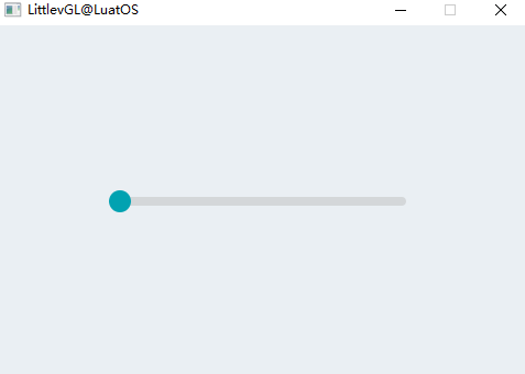
Sample code for the above effect:
local slider_demo = {}

local function event_handler(obj, event)
    if(event == lvgl.EVENT_VALUE_CHANGED) then
        print(string.format("Value: %d\n", lvgl.slider_get_value(obj)));
    end
end

function slider_demo.demo()
    --Create a slider
    local slider = lvgl.slider_create(lvgl.scr_act(), nil);
    lvgl.obj_align(slider, nil, lvgl.ALIGN_CENTER, 0, 0);
    lvgl.obj_set_event_cb(slider, event_handler);
end

return slider_demo
Trimmer(spinbox)#
Overview#
The numeric adjustment box contains a numeric text that can be increased or decreased by keystrokes or API functions. Below the number adjustment box is the modified text box(lvgl.textarea) 。
Parts and Styles#
The main part of the digital adjustment box is called lvgl. SPINBOX_PART_BG , which is a rectangular background using all typical background style properties. It also uses its text style attribute to describe the style of the label.
lvgl.SPINBOX_PART_CURSOR is the virtual part that describes the cursor. Read the text area document for detailed instructions.
Usage#
Set Format#
lvgl.spinbox_set_digit_format(spinbox, digit_count, separator_position) Sets the format of the number. digit_count sets the number of bits. Leading zeros are added to fill the space on the left. spacer_position sets the number of digits before the decimal point. 0 means no decimal point.
lvgl.spinbox_set_padding_left(spinbox, cnt) Add the cnt “space” character between the leftmost digits between the symbols.
Value and Range#
lvgl.spinbox_set_range(spinbox, min, max) Sets the scope of the Spinbox.
lvgl.spinbox_set_value(spinbox, num) Set the value of the Spinbox manually.
lvgl.spinbox_increment(spinbox) and lvgl.spinbox_decrement(spinbox)increment/decrement the value of the Spinbox.
lvgl.spinbox_set_step(spinbox, step) Set the increment decrement.
Event#
In addition to common events, the digital adjustment box also supports the following special events :
lvgl.EVENT_VALUE_CHANGED Sent when the value changes. (Set the value to int32_t as event data)
lvgl.EVENT_INSERT Sent by the parent Text area, but should not be used.
Learn more about events.
Key handling#
Digital adjustment box supports one button:
lvgl.KEY_LEFT/RIGHT Use the keyboard to move the cursor left/right. Use the encoder to decrement/increment the selected number.
LY_KEY_ENTER Apply the selected option (send lvgl.EVENT_VALUE_CHANGED event and close the drop-down list)
lvgl.KEY_ENTER With the encoder get the net number. Jump to the first one after the last one.
Learn more about Key (http://lvgl.100ask.net/7.11/documentation/03_overview/05_indev.html).
Example#
Simple digital adjustment box#
Sample code for the above effect:
local spinbox_demo = {}

local spinbox

local function lvgl.spinbox_increment_event_cb(btn, e)
    if(e == lvgl.EVENT_SHORT_CLICKED or e == lvgl.EVENT_LONG_PRESSED_REPEAT) then
        lvgl.spinbox_increment(spinbox);
    end
end

local function lvgl.spinbox_decrement_event_cb(btn, e)
    if(e == lvgl.EVENT_SHORT_CLICKED or e == lvgl.EVENT_LONG_PRESSED_REPEAT) then
        lvgl.spinbox_decrement(spinbox);
    end
end

function spinbox_demo.demo()
    spinbox = lvgl.spinbox_create(lvgl.scr_act(), nil);
    lvgl.spinbox_set_range(spinbox, -1000, 90000);
    lvgl.spinbox_set_digit_format(spinbox, 5, 2);
    lvgl.spinbox_step_prev(spinbox);
    lvgl.obj_set_width(spinbox, 100);
    lvgl.obj_align(spinbox, nil, lvgl.ALIGN_CENTER, 0, 0);

    local h = lvgl.obj_get_height(spinbox);
    local btn = lvgl.btn_create(lvgl.scr_act(), nil);
    lvgl.obj_set_size(btn, h, h);
    lvgl.obj_align(btn, spinbox, lvgl.ALIGN_OUT_RIGHT_MID, 5, 0);
    lvgl.theme_apply(btn, lvgl.THEME_SPINBOX_BTN);
    lvgl.obj_set_style_local_value_str(btn, lvgl.BTN_PART_MAIN, lvgl.STATE_DEFAULT, lvgl.SYMBOL_PLUS);
    lvgl.obj_set_event_cb(btn, lvgl.spinbox_increment_event_cb);

    btn = lvgl.btn_create(lvgl.scr_act(), btn);
    lvgl.obj_align(btn, spinbox, lvgl.ALIGN_OUT_LEFT_MID, -5, 0);
    lvgl.obj_set_event_cb(btn, lvgl.spinbox_decrement_event_cb);
    lvgl.obj_set_style_local_value_str(btn, lvgl.BTN_PART_MAIN, lvgl.STATE_DEFAULT, lvgl.SYMBOL_MINUS);
end

return spinbox_demo
Rotator(spinner)#
Overview#
The rotator object is a rotating arc on the boundary, which implements the rotating loading effect.
Parts and Styles#
The spinner includes the following part:
lvgl.SPINNER_PART_BG: Main partlvgl.SPINNER_PART_INDIC: Rotating Arc (Dummy Section)
Parts and styles act the same as in the Arc (lvgl.arc) case.
Usage#
arc length#
The length of the arc can be adjusted by `lvgl.spinner_ set_arc_length(spinner, deg).
Rotation speed#
The rotation speed can be adjusted by the `lvgl.spinner_ set_spin_time(preload, time_ms).
Rotation type#
The following rotation types are supported
lvgl.SPINNER_TYPE_SPINNING_ARC Rotate the arc, slow down at the top
lvgl.SPINNER_TYPE_FILLSPIN_ARC Rotate the arc, slowing down at the top, but also stretching the arc
lvgl.SPINNER_TYPE_CONSTANT_ARC Rotate at a constant speed
Set with lvgl.spinner_ set_type(preload, lvgl.SPINNER_TYPE_...)
Rotation direction#
The direction of rotation can be changed via the `lvgl.spinner_ set_dir(preload, lvgl.SPINNER_ DIR_FORWARD/BACKWARD).
Event#
Only common events are supported
Learn more about events.
Key handling#
The object type does not handle any keys.
Learn more about Key (http://lvgl.100ask.net/7.11/documentation/03_overview/05_indev.html).
Example#
Simple Rotation Effect#
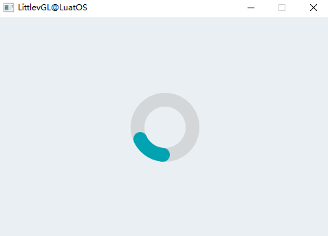
Sample code for the above effect:
local spinner_demo = {}

function spinner_demo.demo()
    --Create a Preloader object
    local preload = lvgl.spinner_create(lvgl.scr_act(), nil);
    lvgl.obj_set_size(preload, 100, 100);
    lvgl.obj_align(preload, nil, lvgl.ALIGN_CENTER, 0, 0);
end

return spinner_demo
Switch(switch)#
Overview#
A switch can be used to turn something on/off. It looks like a small slider.
Parts and Styles#
switch using the following sections
lvgl.SWITCH_PART_BG: Main partlvgl.SWITCH_PART_INDIC: indicators (dummy part)lvgl.SWITCH_PART_KNOB: Knob (virtual part)
The parts and styles are the same as in the case of [http://lvgl.100ask.net/7.11/documentation/04_widgets/26_slider.html (lvgl.slider)]. Read its documentation for detailed instructions.
Usage#
Change Status#
You can change the state of the switch by clicking or by the following function:
lvgl.switch_on(switch, lvgl.ANIM_ON/OFF)Onlvgl.switch_off(switch, lvgl.ANIM_ON/OFF)Offlvgl.switch_toggle(switch, lvgl.ANOM_ON/OFF)Position of toggle switch
Animation time#
The animation time when switching the switch state can be adjusted using the `lvgl.switch_ set_anim_time(switch, anim_time).
Event#
In addition to common events, the switch also supports the following special events :
lvgl.EVENT_VALUE_CHANGED Sent when the switch changes state.
Learn more about events.
Key handling#
The switch can handle the following keys:
lvgl.KEY_UP, lvgl.KEY_RIGHT Open Slider
lvgl.KEY_DOWN, lvgl.KEY_LEFT Close Slider
Learn more about Key (http://lvgl.100ask.net/7.11/documentation/03_overview/05_indev.html).
Example#
Simple switch#
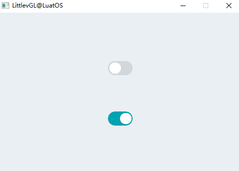
Sample code for the above effect:
local switch_demo = {}

local function event_handler(obj, event)
    if(event == lvgl.EVENT_VALUE_CHANGED) then
        if lvgl.switch_get_state(obj) == true then
            print("State: On\n")
        else
            print("State: Off\n")
        end
    end
end

function switch_demo.demo()
    --Create a switch and apply the styles
    local sw1 = lvgl.switch_create(lvgl.scr_act(), nil);
    lvgl.obj_align(sw1, nil, lvgl.ALIGN_CENTER, 0, -50);
    lvgl.obj_set_event_cb(sw1, event_handler);

    --Copy the first switch and turn it ON
    local sw2 = lvgl.switch_create(lvgl.scr_act(), sw1);
    lvgl.switch_on(sw2, lvgl.ANIM_ON);
    lvgl.obj_align(sw2, nil, lvgl.ALIGN_CENTER, 0, 50);
end

return switch_demo
Table(table)#
Overview#
As usual, tables are built from rows, columns, and cells that contain text.
Table objects are very light weighted because only text is stored. No actual objects are created for the cells, but they are drawn dynamically.
Parts and Styles#
The main part of the form is called lvgl. TABLE_PART_BG . It is a rectangle that resembles a background and uses all the typical background style properties.
For the cell, there are 4 dummy parts. Each cell has a type (1, 2,… 16), which indicates which part of the style is applied to it. The cell part can be composed of lvgl. TABLE_PART_CELL1 x reference, where x is between `0 .. 15.
You can pass lvgl. conf.h in lvgl.conf.h. TABLE_CELL_STYLE_CNT Adjust the number of cell types. 4 by default. The default 4 cell types section is also referenced with private names:
lvgl.TABLE_PART_CELL1lvgl.TABLE_PART_CELL2lvgl.TABLE_PART_CELL3lvgl.TABLE_PART_CELL4
The cell also uses all the typical background style properties. If there is a line break (\n) in the cell content, a horizontal separator is drawn after the line break using the line style attribute.
The text style in a cell is inherited from the cell section or the background section.
Usage#
Rows and Columns(column)#
To set the number of rows and columns, use lvgl.table_set_row_cnt(table, row_cnt)and lvgl.table_set_col_cnt(table, col_cnt)
Width and Height(height)#
The width of the column can be set using `lvgl.table_set_col_width(table, col_id, width). The total width of the Table object is set to the sum of the column widths.
The height is automatically calculated based on the cell style (font, padding, etc.) and the number of rows.
Set cell value type#
Cells can only store text, so numbers need to be converted to text before they can be displayed in a table.
lvgl.table_set_cell_value(table, row, col, "Content") 。The text is held by the table, so it can even be a local variable.
You can use line breaks in text such as `”Value\n60.3.
Align#
You can use lvgl.table_set_cell_align(table, row, col, lvgl.LABEL_ALIGN_LEFT/CENTER/RIGHT)to adjust the alignment of text in cells.
Cell Type(cell_type)#
You can use 4 different cell types. Each has its own style.
The cell type can be used to add different styles, such:
Header
First column
Highlight a cell
Wait.
lvgl. table_type (table, row, col, set_cell_type) can be used to select the type, and the type (type) can be 1, 2, 3 or 4, corresponding to the above four types.
Merge Cells#
Cells can be merged horizontally with `lvgl. set_cell_merge_right_table (table, col, row, true). To merge more adjacent cells, please apply this function to each cell.
Crop Text#
By default, text will wrap to fit the width of the cell, and the height of the cell will be set automatically. To disable this feature and keep the text as it is, enable lvgl.table_set_cell_crop(table, row, col, true) 。
Scroll#
Make table scrollable on page (lvgl.page)
Event#
Only common events are supported
Learn more about events.
Key handling#
The object type does not handle any keys.
Learn more about Key (http://lvgl.100ask.net/7.11/documentation/03_overview/05_indev.html).
Example#
Simple form#
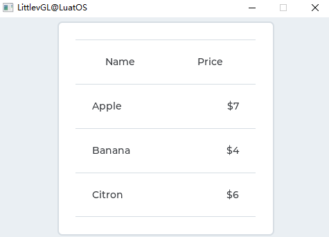
Sample code for the above effect:
local table_demo = {}

function table_demo.demo()
    local table = lvgl.table_create(lvgl.scr_act(), nil);
    lvgl.table_set_col_cnt(table, 2);
    lvgl.table_set_row_cnt(table, 4);
    lvgl.obj_align(table, nil, lvgl.ALIGN_CENTER, 0, 0);

    --Make the cells of the first row center aligned
    lvgl.table_set_cell_align(table, 0, 0, lvgl.LABEL_ALIGN_CENTER);
    lvgl.table_set_cell_align(table, 0, 1, lvgl.LABEL_ALIGN_CENTER);

    --Align the price values to the right in the 2nd column
    lvgl.table_set_cell_align(table, 1, 1, lvgl.LABEL_ALIGN_RIGHT);
    lvgl.table_set_cell_align(table, 2, 1, lvgl.LABEL_ALIGN_RIGHT);
    lvgl.table_set_cell_align(table, 3, 1, lvgl.LABEL_ALIGN_RIGHT);

    lvgl.table_set_cell_type(table, 0, 0, 2);
    lvgl.table_set_cell_type(table, 0, 1, 2);


    --Fill the first column
    lvgl.table_set_cell_value(table, 0, 0, "Name");
    lvgl.table_set_cell_value(table, 1, 0, "Apple");
    lvgl.table_set_cell_value(table, 2, 0, "Banana");
    lvgl.table_set_cell_value(table, 3, 0, "Citron");

    --Fill the second column
    lvgl.table_set_cell_value(table, 0, 1, "Price");
    lvgl.table_set_cell_value(table, 1, 1, "$7");
    lvgl.table_set_cell_value(table, 2, 1, "$4");
    lvgl.table_set_cell_value(table, 3, 1, "$6");

end

return table_demo
Label View(tabview)#
Overview#
Tab objects can be used to organize the content in tabs.
Parts and Styles#
Tab The view object contains several parts. Mostly lvgl. TABVIEW_PART_BG . It is a rectangular container that holds the rest of the tab view.
2 important practical parts created on the background:
lvgl.TABVIEW_PART_BG_SCRLThis is the scrollable portion of the page (lvgl.page). It makes the contents of the tabs adjacent to each other. The background of the page is always transparent and not accessible from the outside.lvgl.TABVIEW_PART_TAB_BGThe tab button is a Button Matrix (lvgl.btnmatrix). Click the button tolvgl. TABVIEW_PART_BG_SCRLScroll to the contents of the relevant tab. You can passlvgl. TABVIEW_PART_TAB_BTN theAccess Tabsbutton. When you select a tab, the button is selected and you can uselvgl. STATE_CHECKEDsets the style. The height of the tabs button matrix is calculated from the font height plus the background and button-style padding.
All of the sections listed support typical background style properties and fills.
lvgl.TABVIEW_PART_TAB_BG There is also an actual part, an indicator, called lvgl. TABVIEW_PART_INDIC . It is a thin rectangle-like object under the currently selected tab. When a tab view is animated to other tabs the indicator will also be animated. It can be a style that uses typical background style properties. The size style property sets its thickness.
After the new tab is added, the lvgl. TABVIEW_PART_BG_SCRL to create a page for it and add the new button to lvgl. TABVIEW_PART_TAB_BG button matrix. The created pages can be used as normal pages, they have the usual page parts.
Usage#
Select Label#
Select a tag by the following method:
Click it on the button matrix section
Slide
Using the
lvgl.tabview_ set_tab_act(tabview, id, lvgl.ANIM_ON/OFF)function
Change the name of a label#
To change the name of the tab ID (the display text of the underlying button matrix) at runtime, you can use the function lvgl.tabview_set_tab_name(tabview, id, name) 。
Animation time#
The animation time is adjusted by `lvgl.tabview_ set_anim_time(tabview, anim_time_ms). Used when loading a new tab.
Rolling Propagation#
Because the content object of a tab is a Page, it can receive scroll propagation from other Page-like objects. For example, if a text area is created on the content of a tab, and the text area is scrolled, but the end is reached, the scroll can propagate to the content page. It can be enabled using ``lvgl.page/textarea_set_scroll_propagation(obj, true).
By default, the tabs content page has scroll propagation enabled, so when they scroll horizontally, the scrolling content will propagate to lvgl. TABVIEW_PART_BG_SCRL `so that the page will be scrolled.
Manual sliding can be disabled using `lvgl.page_set_scroll_propagation(tab_page, false).
Event#
In addition to Common Events, the tab also supports the following Special Events :
lvgl.EVENT_VALUE_CHANGED Sent when a new tab is selected by sliding or clicking the tab button
Learn more about events.
Key handling#
check box to handle the following keys:
lvgl.KEY_RIGHT/LEFT Select a tag
lvgl.KEY_ENTER Change Change to Selected Label
Learn more about Key (http://lvgl.100ask.net/7.11/documentation/03_overview/05_indev.html).
Example#
Simple Tab#
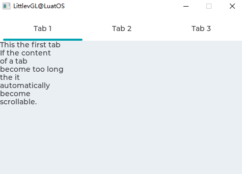
Sample code for the above effect:
local tabview_demo = {}

function tabview_demo.demo()
    --Create a Tab view object
    local tabview;
    tabview = lvgl.tabview_create(lvgl.scr_act(), nil);

    --Add 3 tabs (the tabs are page (lvgl.page) and can be scrolled
    local tab1 = lvgl.tabview_add_tab(tabview, "Tab 1");
    local tab2 = lvgl.tabview_add_tab(tabview, "Tab 2");
    local tab3 = lvgl.tabview_add_tab(tabview, "Tab 3");


    --Add content to the tabs
    local label = lvgl.label_create(tab1, nil);
    lvgl.label_set_text(label,
[[This the first tab
If the content
of a tab
become too long
the it
automatically
become
scrollable.]]);

    label = lvgl.label_create(tab2, nil);
    lvgl.label_set_text(label, "Second tab");

    label = lvgl.label_create(tab3, nil);
    lvgl.label_set_text(label, "Third tab");
end

return tabview_demo
Text Box(textarea)#
Overview#
The text box is a page (lvgl.page) with a label and cursor. You can add text or characters to it. Long lines are line-wrapping, and when the text becomes long enough, the text area can be scrolled.
Parts and Styles#
The text box has the same portion as the page (lvgl.page). Expect lvgl. PAGE_PART_SCRL because it cannot be quoted and is always transparent. Please refer to the detailed documentation on that page.
In addition to the Page part, there is also a virtual ``lvgl. TEXTAREA_PART_CURSOR the section to draw the cursor. The area of the cursor is always the bounding box of the current character. Can be passed in lvgl. Add the background color and background color to the TEXTAREA_PART_CURSOR style to create a block cursor. Create a row cursor to make the cursor transparent and set border_side properties.
Usage#
Add Text#
You can use the following commands to insert text or characters at the current cursor position:
lvgl.textarea_add_char(textarea, 'c')lvgl.textarea_add_text(textarea, "insert this text")
To add wide characters, such as ‘’á ‘’, ‘’ß’’, or CJK characters (Chinese-Japanese-Korean unified ideograph), use lvgl.textarea_add_text(ta, "á") 。
lvgl.textarea_set_text(ta, "New text") Change the entire text.
Placeholder#
You can use the lvgl.textarea_ set_placeholder_text(ta, "Placeholder text")to specify a placeholder text-to display when the Text area is empty.
Delete Characters#
To remove a character from the left of the current cursor position, use lvgl.textarea_del_char(textarea)
To delete from the right, use lvgl.textarea_del_char(textarea)
Move cursor#
You can use the lvgl.textarea_ set_cursor_pos(textarea, 10)to modify the cursor position directly. The 0 position means “before the first character”, lvgl. TA_CURSOR_LAST means “after the last character”
can be used
lvgl.textarea_cursor_right(textarea)lvgl.textarea_cursor_left(textarea)lvgl.textarea_cursor_up(textarea)lvgl.textarea_cursor_down(textarea)
If you call the lvgl.textarea_ set_cursor_click_pos(textarea, true), the cursor jumps to where you clicked the Text area.
Hide Cursor#
You can use lvgl.textarea_ set_cursor_hidden(textarea, true)to hide the cursor.
Cursor blink time#
The blinking time of the cursor can be adjusted by `lvgl.textarea_ set_cursor_blink_time(textarea, time_ms).
Single-line mode#
The Text area can be configured with lvgl.textarea_ set_one_line(ta, true)on one line. In this mode, the height is automatically set to display only one line, line breaks are ignored, and automatic line breaks are disabled.
Password mode#
The text area supports password modes that can be enabled with the `lvgl.textarea_ set_pwd_mode(textarea, true).
If there is a • ( Bullet,U 2022) character in the font, the entered character will be converted to that character after a period of time or after entering a new character. If • does not exist, will use * 。
In password mode lvgl.textarea_ get_text(textarea)gives real text, not bullet characters.
The visibility time can be adjusted using the lvgl.textarea_ set_pwd_show_time(textarea,time_ms).
Text Alignment#
You can use the lvgl.textarea_ set_text_align(textarea, lvgl.LABEL_ALIGN_LET/CENTER/RIGHT)to align text to the left, center, or right.
In single-line mode, text can be scrolled horizontally only when the text remains aligned.
Character filtering#
The list of acceptable characters can be set using the `lvgl.textarae_ set_accepted_chars(ta, “0123456789. -“). Other characters are ignored.
Maximum Text Length#
The maximum number of characters can be limited by lvgl.textarea_ set_max_length(textarea, max_char_num)
Long text#
If the text in the Text area is long (for example,> 20k characters), it may be slow to scroll and draw. However, by enabling lvgl. conf.h. LABEL_LONG_TXT_HINT 1 can greatly improve it. It will save some information about the label to speed up its drawing. Use lvgl. LABEL_LONG_TXT_HINT , scrolling and drawing will be as fast as using “normal” short text.
Select Text#
If enabled by the lvgl.textarea_ set_text_sel(textarea, true), you can select a portion of the text. Just like when selecting text on a PC with the mouse.
Scroll bar#
Scroll bars can be displayed according to different policies set by the `lvgl.textarea_ set_scrollbar_mode(textarea, lvgl.SCRLBAR_MODE_…). Learn more in the Page object.
Rolling Propagation#
When the Text area is scrolled over another scrollable object (such as a Page) and the scrolling has reached the edge of the Text area, the scrolling can propagate to the parent object. That is, when the Text area can be scrolled further, the parent will be scrolled.
It can be enabled using `lvgl.ta_set_scroll_propagation(ta, true).
Learn more in the Page (lvgl.page) object.
Edge flicker#
When the “text” area is scrolled to the edge, if enabled by lvgl.ta_set_edge_flash(ta, true), a circle similar to Flash animation can be displayed
Event#
In addition to common events, the text box also supports the following special events :
lvgl.EVENT_INSERT Send before inserting characters or text. The event data is the text that is scheduled to be inserted. lvgl.ta_set_insert_replace(ta, “new text”) replaces the text to be inserted. The new text cannot be in a local variable, which is destroyed when the event callback exists. “” means do not insert anything.
lvgl.EVENT_VALUE_CHANGED When the content of the text area has changed.
lvgl.EVENT_APPLY When lvgl.KEY_ENTER is sent to a text area in single-line mode.
Learn more about events.
Key handling#
The text box can handle the following keys:
lvgl.KEY_UP/DOWN/LEFT/RIGHT Move cursor
Any character Adds a character to the current cursor position
Learn more about Key (http://lvgl.100ask.net/7.11/documentation/03_overview/05_indev.html).
Example#
Simple Text Box#
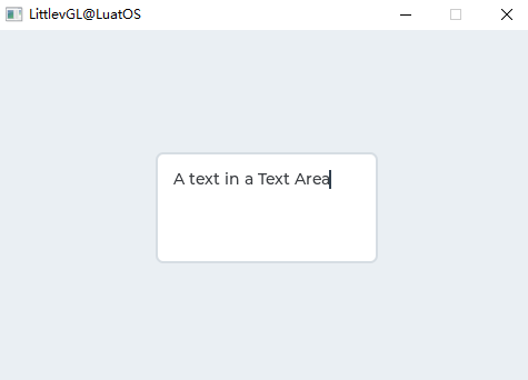
Sample code for the above effect:
local textarea = {}

local ta1;
local i = 1;
local function event_handler(obj, event)
    if(event == lvgl.EVENT_VALUE_CHANGED) then
        print(string.format("Value: %s\n", lvgl.textarea_get_text(obj)));
    elseif (event == lvgl.EVENT_LONG_PRESSED_REPEAT) then
        --For simple test: Long press the Text are to add the text below
        local txt = "\n\nYou can scroll it if the text is long enough.\n";
        if(i <= #txt) then
            lvgl.textarea_add_char(ta1, txt:byte(i));
            i=i+1;
        end
    end
end

function textarea.demo()
    ta1 = lvgl.textarea_create(lvgl.scr_act(), nil);
    lvgl.obj_set_size(ta1, 200, 100);
    lvgl.obj_align(ta1, nil, lvgl.ALIGN_CENTER, 0, 0);
    lvgl.textarea_set_text(ta1, "A text in a Text Area");    --Set an initial text
    lvgl.obj_set_event_cb(ta1, event_handler);
end

return textarea
Tile View(tileview)#
Overview#
A tile view (Tileview) is a container object whose elements, called tiles, can be arranged in a grid. By swiping, the user can navigate between the tiles.
If the Tileview is screen-sized, it will provide the user interface you might already see on a smartwatch.
Parts and Styles#
Tileview has the same portion as page (lvgl.page). Expect lvgl. PAGE_PART_SCRL because it cannot be quoted and is always transparent. Please refer to the detailed documentation on that page.
Usage#
effective area#
The tiles do not have to form a complete grid where every element is present. There can be holes in the grid, but they must be continuous, that is, there can be no empty rows or columns.
Valid locations can be set using the lvgl.tileview_ set_valid_positions(tileview, valid_pos_array, array_len). You can only scroll to this position. The 0,0 index represents the upper left tile. For example. The lvgl.point_t valid_pos_array[] = {{0,0}, {0,1}, {1,1}, {{lvgl.COORD_MIN, lvgl.COORD_MIN}}gives an "L"-shaped view of the tile. It indicates that there are no tiles in {1,1}`, so users cannot scroll here.
In other words, the valid_pos_array tells where the tile is. It can be changed on the fly to disable certain locations on specific tiles. For example, there may be a 2x 2 grid where all tiles are added, but the first row (y = 0) serves as the “main row” and the second row (y = 1) contains options for the tiles above it. Suppose that horizontal scrolling can only be done in the main line, but not between options in the second line. In this case, the `valid_pos_array needs to be changed when selecting a new main tile:
For the first primary tile:
{0,0},{0,1},{1,0}to disable the{1,1}option tileFor the second primary tile:
{0,0},{1,0},{1,1}to disable the{0,1}option tile
Set Tiles#
Sets the currently visible block to use: lvgl.tileview_set_tile_act(tileview, x_id, y_id, lvgl.ANIM_ON/OFF)
Add Element#
To add an element, simply create an object on the Tileview and manually position it to the desired location.
lvgl.tileview_add_element(tielview, element) should be used to make the Tileview scroll (drag) one of its elements. For example, if there is a button on the tile, you need to explicitly add the button to the Tileview so that the user can also use the button to scroll Tileview。
Rolling Propagation#
The scroll propagation function of page-like objects such as lvgl. list can be used well here. For example, you can have a complete list (lvgl.list), and when the list reaches the top or bottom, the user will scroll the tile view instead.
Animation time#
The animation time of the tiled view can be adjusted using the `lvgl.tileview_ set_anim_time(tileview, anim_time).
Apply animation when
Select a new tile with `lvgl.tileview_ set_tile_act
The current tile scrolls slightly and then releases (restores the original title)
The current tile scrolls more than half the size, then releases (moves to the next tile)
Edge Flash#
An “edge flash” effect can be added when the scroll reached tile view hits an invalid position or the end of the tile view.
Use the lvgl.tileview_ set_edge_flash(tileview, true)to enable this feature.
Event#
In addition to Common Events, the tile view supports the following Special Events :
**lvgl.EVENT_VALUE_CHANGED ** Sent when a new tile with a scroll or
lvgl.tileview_ set_act is loaded. Set the event data to the index of the new tile in valid_pos_array (its type isuint32_t *` )
Learn more about events.
Key handling#
Tile view can handle the following keys:
lvgl.KEY_UP, lvgl.KEY_RIGHT Increase the value of the slider 1
lvgl.KEY_DOWN, lvgl.KEY_LEFT Subtract the value of the slider 1
Learn more about Key (http://lvgl.100ask.net/7.11/documentation/03_overview/05_indev.html).
Example#
Tile view with content#
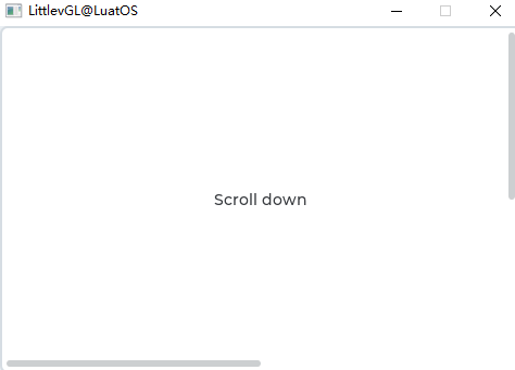
Sample code for the above effect:
local tileview_demo = {}

function tileview_demo.demo()

    local lvgl.VER_RES = lvgl.disp_get_ver_res(lvgl.disp_get_default())
    local lvgl.HOR_RES = lvgl.disp_get_hor_res(lvgl.disp_get_default())

    local valid_pos = {{0,0}, {0, 1}, {1,1}};
    local tileview;
    tileview = lvgl.tileview_create(lvgl.scr_act(), nil);
    lvgl.tileview_set_valid_positions(tileview, valid_pos, 3);
    lvgl.tileview_set_edge_flash(tileview, true);

    local tile1 = lvgl.obj_create(tileview, nil);
    lvgl.obj_set_size(tile1, lvgl.HOR_RES, lvgl.VER_RES);
    lvgl.tileview_add_element(tileview, tile1);

    --Tile1: just a label
    local label = lvgl.label_create(tile1, nil);
    lvgl.label_set_text(label, "Scroll down");
    lvgl.obj_align(label, nil, lvgl.ALIGN_CENTER, 0, 0);

    --Tile2: a list
    local list = lvgl.list_create(tileview, nil);
    lvgl.obj_set_size(list, lvgl.HOR_RES, lvgl.VER_RES);
    lvgl.obj_set_pos(list, 0, lvgl.VER_RES);
    lvgl.list_set_scroll_propagation(list, true);
    lvgl.list_set_scrollbar_mode(list, lvgl.SCROLLBAR_MODE_OFF);

    lvgl.list_add_btn(list, nil, "One");
    lvgl.list_add_btn(list, nil, "Two");
    lvgl.list_add_btn(list, nil, "Three");
    lvgl.list_add_btn(list, nil, "Four");
    lvgl.list_add_btn(list, nil, "Five");
    lvgl.list_add_btn(list, nil, "Six");
    lvgl.list_add_btn(list, nil, "Seven");
    lvgl.list_add_btn(list, nil, "Eight");

    --Tile3: a button
    local tile3 = lvgl.obj_create(tileview, tile1);
    lvgl.obj_set_pos(tile3, lvgl.HOR_RES, lvgl.VER_RES);
    lvgl.tileview_add_element(tileview, tile3);

    local btn = lvgl.btn_create(tile3, nil);
    lvgl.obj_align(btn, nil, lvgl.ALIGN_CENTER, 0, 0);
    lvgl.tileview_add_element(tileview, btn);
    label = lvgl.label_create(btn, nil);
    lvgl.label_set_text(label, "No scroll up");
end

return tileview_demo
Window (win)#
Overview#
A window is an object like a container (lvgl.cont), built from a title with a title and buttons, and a content area.
Parts and Styles#
The main part is lvgl. WIN_PART_BG , which contains two other actual parts:
lvgl.WIN_PART_HEADERTitle container at the top with title and control buttonslvgl.WIN_PART_CONTENT_SCRLThe scrollable portion of the page for content below the header.
Besides, lvgl. WIN_PART_CONTENT_SCRL also has a scroll bar called lvgl. WIN_PART_CONTENT_SCRL . Read the documentation for Page (lvgl.page) for more details about the scroll bars.
All sections support typical background properties. The title uses the Text property of the title section.
The height of the control button is: Header height-Header padding_top-Header padding_bottom。
Usage#
Window Title#
There is a title on the window, which can be modified lvgl.win_set_title(win, "New title")
Control button#
You can add a control button to the right of the window title with the following command: lvgl.win_add_btn_right(win, lvgl.SYMBOL_CLOSE)To add a button to the left of the window title, use lvgl.win_add_btn_left(win, lvgl.SYMBOL_CLOSE). The second parameter is the image source, so it can be a symbol, a pointer to the lvgl.img_dsc_t variable, or the path to the file.
You can use lvgl.win_add_btn_left(win, lvgl.SYMBOL_CLOSE)to set the width of the button. If w = = 0 , the button will be square.
lvgl.win_close_event_cb Can be used as an event callback to close a window.
Scroll bar#
Scroll bar behavior can be set via `lvgl.win_set_scrlbar_mode(win, lvgl.SCRLBAR_MODE_…). For more information, see the page(lvgl.page) 。
Manual scrolling and focusing#
To scroll the window directly, you can use lvgl.win_scroll_hor(win, dist_px)or lvgl.win_scroll_ver(win, dist_px) 。
To have a window display an object on it, use lvgl.win_focus(win, child, lvgl.ANIM_ON/OFF) 。
The time of scrolling and focus animation can be adjusted using lvgl.win_set_anim_time(win, anim_time_ms)
Layout#
To set the layout of the content, use lvgl.win_set_layout(win, lvgl.LAYOUT_...). For more information, see the container(lvgl.cont) 。
Event#
Only common events are supported
Learn more about events.
Key handling#
window can handle the following keys:
lvgl.KEY_RIGHT/LEFT/UP/DOWN Scroll Page
Learn more about Key (http://lvgl.100ask.net/7.11/documentation/03_overview/05_indev.html).
Example#
Simple window#
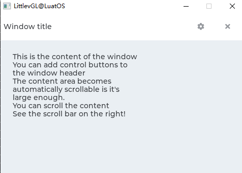
Sample code for the above effect:
local win_demo = {}

function win_demo.demo()
    --Create a window
    local win = lvgl.win_create(lvgl.scr_act(), nil);
    lvgl.win_set_title(win, "Window title");                        --Set the title


    --Add control button to the header
    local close_btn = lvgl.win_add_btn(win, lvgl.SYMBOL_CLOSE);           --Add close button and use built-in close action
    lvgl.obj_set_event_cb(close_btn, lvgl.win_close_event_cb);
    lvgl.win_add_btn(win, lvgl.SYMBOL_SETTINGS);        --Add a setup button

    --Add some dummy content
    local txt = lvgl.label_create(win, nil);
    lvgl.label_set_text(txt,
[[This is the content of the window
You can add control buttons to
the window header
The content area becomes
automatically scrollable is it's
large enough.
You can scroll the content
See the scroll bar on the right!]]);
end

return win_demo
LVGL Advanced#
Animation#
Theme#
File System#
Input Devices#
Font#
LVGL Font support is very complete, support UTF-8 encoded Unicode characters, divided into internal fonts and external fonts, font production tools are also many:LVGL official font production tools, third-party LvglFontTool and MCU_Font, etc. This article will introduce different font production methods using different tools to make everyone understand it.
Internal Font#
LVGL The internal fonts are divided into LVGL own fonts and self-made custom internal fonts.
Internal self-supporting fonts#
LVGL The internal of the already supports a variety of font sizes, which can be enabled in lv_conf.h through * LV_FONT_…* definition
/* Montserrat fonts with bpp = 4
 * https://fonts.google.com/specimen/Montserrat  */
#define LV_FONT_MONTSERRAT_8     0
#define LV_FONT_MONTSERRAT_10    0
#define LV_FONT_MONTSERRAT_12    0
#define LV_FONT_MONTSERRAT_14    1
#define LV_FONT_MONTSERRAT_16    0
#define LV_FONT_MONTSERRAT_18    0
#define LV_FONT_MONTSERRAT_20    0
#define LV_FONT_MONTSERRAT_22    0
#define LV_FONT_MONTSERRAT_24    0
#define LV_FONT_MONTSERRAT_26    0
#define LV_FONT_MONTSERRAT_28    0
#define LV_FONT_MONTSERRAT_30    0
#define LV_FONT_MONTSERRAT_32    0
#define LV_FONT_MONTSERRAT_34    0
#define LV_FONT_MONTSERRAT_36    0
#define LV_FONT_MONTSERRAT_38    0
#define LV_FONT_MONTSERRAT_40    0
#define LV_FONT_MONTSERRAT_42    0
#define LV_FONT_MONTSERRAT_44    0
#define LV_FONT_MONTSERRAT_46    0
#define LV_FONT_MONTSERRAT_48    0

/* Demonstrate special features */
#define LV_FONT_MONTSERRAT_12_SUBPX      0
#define LV_FONT_MONTSERRAT_28_COMPRESSED 0  /*bpp = 3*/
#define LV_FONT_DEJAVU_16_PERSIAN_HEBREW 0  /*Hebrew, Arabic, PErisan letters and all their forms*/
#define LV_FONT_SIMSUN_16_CJK            0  /*1000 most common CJK radicals*/

/*Pixel perfect monospace font
 * http://pelulamu.net/unscii/ */
#define LV_FONT_UNSCII_8     0
#define LV_FONT_UNSCII_16     0
At the same time, it supports multiple languages: Hebrew, Arabic, Persian letters and all their forms, and supports Chinese, but in fact, the support for Chinese is composed of more than 1000 most common radicals. The actual test will find that many Chinese characters are not~
Internal Custom Font#
What should you do when you want to use some nice fonts, or Chinese fonts that are not integrated with LVGL? Of course, you can make your own font. The first thing to introduce is to use LvglFontTool to make internal fonts. Open LvglFontTool
Anti-aliasing is selected by default. Our lvgl is the 7.11 version, so the version here is selected for 6.0 version or above. English and numbers are checked according to their own needs. The type is selected as internal fonts. The rest is checked. The font name is set by itself. The lvgl.h header file is included. Then we click to select fonts.
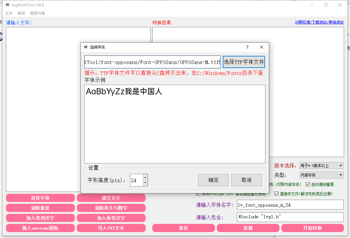
Font We select our ttf font, select the font size, click OK After that, write the required Chinese characters or click to add common Chinese characters, all Chinese characters and icons according to your needs.
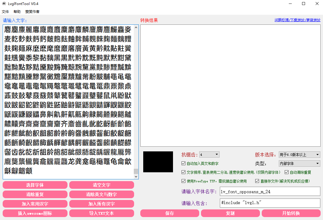 After that click save to start the conversion
 Wait a little.
 Then place the generated. c file in the LuatOS\components\lvgl\font directory and declare your font in luat_lvgl_fonts.h
#ifndef LUAT_LIB_FONTS_H
#define LUAT_LIB_FONTS_H

#include "luat_base.h"

#ifdef __cplusplus
extern "C" {
#endif
#include "../src/lv_font/lv_font.h"

LV_FONT_DECLARE(lv_font_opposans_m_8)
LV_FONT_DECLARE(lv_font_opposans_m_10)
LV_FONT_DECLARE(lv_font_opposans_m_12)
LV_FONT_DECLARE(lv_font_opposans_m_14)
LV_FONT_DECLARE(lv_font_opposans_m_16)
LV_FONT_DECLARE(lv_font_opposans_m_18)
LV_FONT_DECLARE(lv_font_opposans_m_20)
LV_FONT_DECLARE(lv_font_opposans_m_22)
LV_FONT_DECLARE(lv_font_simsun_48)

#ifdef __cplusplus
}
#endif
#endif
After that, you can expose your font library to lua in the following way.
/*
Get Built-in Font
@api lvgl.font_get(name)
@string Font name font size, for example opposans_m_10 simsun_48
@return userdata Font Pointer
@usage

local font = lvgl.font_get("simsun_48")
*/
int luat_lv_font_get(lua_State *L) {
    lv_font_t* font = NULL;
    const char* fontname = luaL_checkstring(L, 1);
    if (!strcmp("", fontname)) {
    }
#ifdef LV_FONT_MONTSERRAT_14
    else if (!strcmp("montserrat_14", fontname)) { font = &lv_font_montserrat_14;}
#endif
#ifdef LV_FONT_OPPOSANS_M_8
    else if (!strcmp("opposans_m_8", fontname)) { font = &lv_font_opposans_m_8;}
#endif
#ifdef LV_FONT_OPPOSANS_M_10
    else if (!strcmp("opposans_m_10", fontname)) { font = &lv_font_opposans_m_10;}
#endif
#ifdef LV_FONT_OPPOSANS_M_12
    else if (!strcmp("opposans_m_12", fontname)) { font = &lv_font_opposans_m_12;}
#endif
#ifdef LV_FONT_OPPOSANS_M_14
    else if (!strcmp("opposans_m_14", fontname)) { font = &lv_font_opposans_m_14;}
#endif
#ifdef LV_FONT_OPPOSANS_M_16
    else if (!strcmp("opposans_m_16", fontname)) { font = &lv_font_opposans_m_16;}
#endif
#ifdef LV_FONT_OPPOSANS_M_18
    else if (!strcmp("opposans_m_18", fontname)) { font = &lv_font_opposans_m_18;}
#endif
#ifdef LV_FONT_OPPOSANS_M_20
    else if (!strcmp("opposans_m_20", fontname)) { font = &lv_font_opposans_m_20;}
#endif
#ifdef LV_FONT_OPPOSANS_M_22
    else if (!strcmp("opposans_m_22", fontname)) { font = &lv_font_opposans_m_22;}
#endif
#ifdef USE_LVGL_SIMSUN_48
    else if (!strcmp("simsun_48", fontname)) { font = &lv_font_simsun_48;}
#endif

    if (font) {
        lua_pushlightuserdata(L, font);
        return 1;
    }
    return 0;
}
Note: Don’t forget to enable lvgl and word library in luat_conf_bsp.h when compiling~
External Font#
LVGL At the same time, it supports external fonts. You can put. bin format fonts in flash or sd and load fonts during program operation. This method does not need to modify firmware.
Here we use offline LVGL official tool to generate external fonts
First install nodejs here do not introduce, download and install
Open cmd to run
npm i lv_font_conv -g
can be installed lv_font_conv
We cmd run the lv_font_conv test
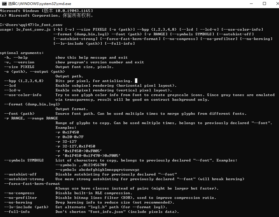
Prove that the lv_font_conv is functioning properly
Let’s take a look at the lv_font_conv command.:
Common Commands:
--bpp- bits per pixel (anti-aliasing)--size- Output font size (pixels)-o,--output- Output path (file or directory, depending on the format)--format- Output Format--format dump- Dump glyph images and font information for debugging--format bin- Dump fonts in binary form (as described in specification)--format lvgl- Dump fonts in LittlevGL format
--force-fast-kern-format- Always use the faster kering storage format, but at a cost. If there is a size difference, it will be displayed--lcd- Generate bitmaps with 3x horizontal resolution for sub-pixel smoothing--lcd-v- Generate bitmaps with 3x vertical resolution for sub-pixel smoothing--use-color-info- Try using the glyph color information in the font to create a grayscale icon. Since the gray tone is simulated by transparency, it will work well only on a contrasting background--lv-include- Only with-- format lvgl, set alternate pathlvgl.h
Font command:
--font- The path to the font file (ttf/woff/woff2/otf). Can be used multiple times for consolidation-r,--range- A single glyph or range optional mapping, belonging to a previously declared-- font. Can be used multiple times. Examples:-r 0x1F450- Single value, decimal, or hexadecimal format-r 0x1F450-0x1F470- Scope-r '0x1F450=>0xF005'- Single glyph with mapping-r '0x1F450-0x1F470=>0xF005'- Range with Mapping-r 0x1F450 -r 0x1F451-0x1F470- 2 Range-r 0x1F450,0x1F451-0x1F470- Ibid., but defined single-r
--symbols- The list of characters to copy (not the number format in-r)--symbols 0123456789.,- Extract characters to display numbers
--autohint-off- Do not force automatic prompts (the “light” is on by default)--autohint-strong- Use a more powerful automatic prompt (will destroy the kerning.)
Other debugging options:
--no-compress- Disable built-in RLE compression--no-prefilter- Disable Bitmap Line Filter (XOR) for improved compression--no-kerning- Remove kerning information to reduce size (not recommend)--full-info- Do not shorten “font_info.json” (including pixel data)
We can generate the. bin external font library we want by entering the following command
lv_font_conv --no-compress --format bin --font H:\OPPOSans-M.ttf -o H:\myfontd\opposans_m_8.bin --bpp 4 --size 8 -r 0x30-0x39 -r 0x41-0x5A -r 0x61-0x7A -r 0x4E00-0x9FFF
Don’t want to do it yourself? Okay, I ‘ve already made some and put them in the LuatOS\docs\markdown\exts\lvgl\fonts directory~
Font Usage#
Font use is very simple, use lvgl.obj_set_style_local_text_font to set the font, external font files need to be loaded using lvgl.font_load function, let’s take a look at the example below.:
Note: Remember to release the font after use
Internal Font:
	local screen_label = lvgl.label_create(nil, nil)
	lvgl.label_set_text(screen_label, "Chinese test abcdABCD1234")
	local style_screen_label_main = lvgl.style_create()
	lvgl.style_set_text_font(style_screen_label_main, lvgl.STATE_DEFAULT, lvgl.font_get("opposans_m_12"))
	lvgl.obj_add_style(screen_label, lvgl.LABEL_PART_MAIN, style_screen_label4_main)
    lvgl.scr_load(screen_label)
Effect:

External Font:
	local screen_label = lvgl.label_create(nil, nil)
	lvgl.label_set_text(screen_label, "This is a Chinese font test program abcdABCD1234")
    local font = lvgl.font_load("/OPPOSans.bin")
    lvgl.obj_set_style_local_text_font(screen_label, lvgl.LABEL_PART_MAIN, lvgl.STATE_DEFAULT, font)
    lvgl.scr_load(screen_label)
Effect:
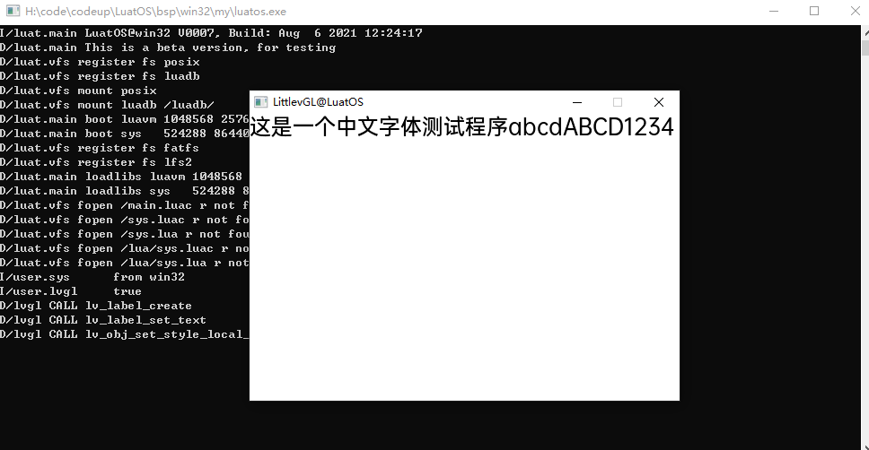
Font Description#
The font used in this article is OPPO’s OPPO Sans font, (including Chinese and Western languages, with 6 characters in weight) which allows individuals or enterprises to use it free of charge, including commercial purposes, and the copyright belongs to OPPO Guangdong Mobile Communications Co., Ltd.
You should abide by the following terms and conditions, and offenders will be prosecuted.:
No font adaptation or secondary development;
Don’t sell fonts;
No other download channels available to others;
Not for illegal use.